Archive for the ‘Information Visualization’ Category
Create Your Very Own Infographic
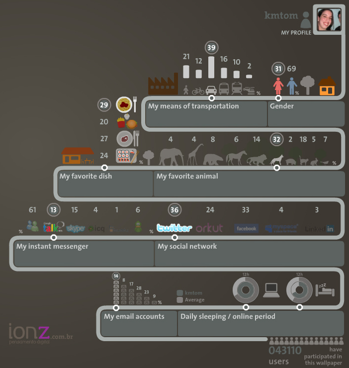
Ionz has created an interface that allows you to create your own infographic to represent who you are. I’m not sure if I would have gone with the same 9 categories, but it’s a really cool concept! [In the top right corner you can change to the British flag so you don’t have to read it in Portuguese, I mean unless you want to.]
One thing I’d love to see here was a more detailed breakdown of how I spend my time and what I use for transportation. I mainly use a car, but sometimes I use public transportation or my new bike. I also spend more than 12 hours online [slightly shamed]. Well, I guess this will give you a little insight into who I am…
Pixar Characters
There’s something so simple about all the Pixar films and short films. Take for example For the Birds. Not a single word is spoken in the 3:00+ clip.
In keeping with that theme, juanpablobravo! has created an illustration of all of the Pixar characters. It’s so hard to choose, but I do love Mike Wazowski.
Are You a Nerd?
Use this handy vendiagram from Matthew Mason to find out if you’re a nerd.
First, ask yourself 3 questions:
1. Am I intelligent?
2. Am I socially inept?
3. Am I obsessed? (If you have to ask yourself if you are or not, you probably are.)
Then see how you classify below…
[Note: If you didn’t answer “Yes” to any of the above questions, you probably shouldn’t be reading this blog. Or, perhaps you should read it more!]
via CoolInfographics
Facebook Fact Sheet
As a good addition to the list of 10 social media inforgraphics, this recent “fast sheet” displays some interesting information. Here are some highlights as provided by BusinessInsider:
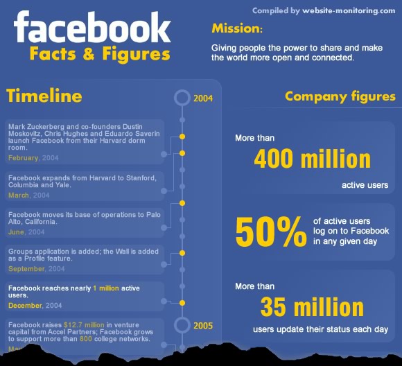
[Click to view the full image]
via @SaraBrody via @certaintragedy
Social Media Infographics
Social Media is the buzz these days, everyone’s got to be in it from your Grandma to your pizzeria. Sarah Chong over at Penn Olsen has compiled 10 Social Media Inforgraphics spanning across many different sites. I enjoyed the “Journey of a Tweet” (shown below) and also liked “Chicks Rule“, with the exception of Digg.
via @Manya
Google Wave, demystified
What’s all the fuss about Google Wave? This video explains it. It seems like it is smashing GMail with Google Docs and MS Word’s “track changes”.
UPDATE: 11/22/2009
I have received my Google Wave invite (thanks to Kyle Bedell). But I’m not really sure what to do with it. I don’t really send e-mails to groups at this point in my life. I basically use gmail for personal communication and to get updates on geocaching and other listservs. It is blocked at work, so I couldn’t use it for that purpose even if I wanted to. I’ll have to recruit a friend to try it out with me.
—-
via SwissMiss
New Boston T Map
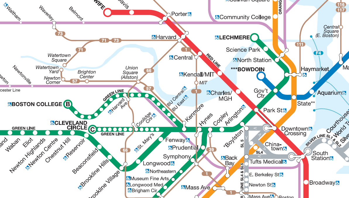
Last week the MBTA released a new T map. Although it may not be as famous as the London Underground map, to me it’s significantly more useful. I appreciate the addition of the bus routes and it helps me get a perspective of the relationships between all the different stations. It still doesn’t help me see a clear way to the airport though…
via WBZ.com
Can you paint with all the Colors of the Wind?
Color plays a vital role in a lot of things that we do.
The SAP Design Guild has an article about all things color. It is basically an overview of all that can go good and bad with color including chromostereoopis, lateral inhibition, and subjective contours.
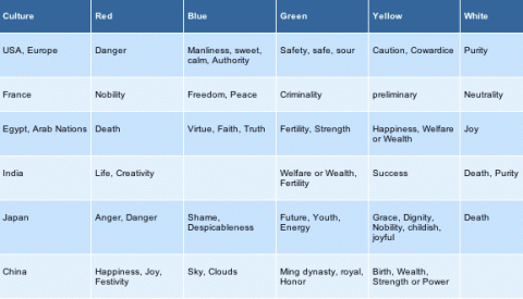
As I’m sure we all learned in English class at one point that a word can have a connotative and denotative meaning. The way that I learned it was that red was the color of an apple (denotative) and also meant danger (connotative). This chart (from SAP Design Guild) shows the connotative meaning for colors across different cultures.
But what about those people who cannot see color [about 8% of the male population and some smaller % of the female population]? WeAreColorblind.com provides patterns for designing with colorblindness in mind. They also provide tools and examples of good design and poor design.
clocktwo for the iPhone
I really enjoy clocks! I plan on eventually designing some rooms around clocks. For now I have to display my creativity through cheaper means; one is through my screen saver – DropClock – which is a series of numbers which fall for a minute into water.
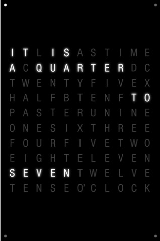 If I had an iPhone, I’d strongly consider using clocktwo, which is very similar in its design to DropClock. Black, white, simple. This one however is a little bit harder to actually tell what time, which is probably the most important thing about a clock. Still, it’s pretty cool to look at.
Actual iPhone users [wishing I were in this group] look to be complaining that it cannot be set as a wallpaper. It would be cool to be able to just touch to see the time, as opposed to -I assume – having to open the app.
via SwissMiss
The Hierarchy of Digital Distractions
An interesting depiction of the hierarchy of the distractions we face in our lives everyday. I’m sure they will differ for each person, but a lot of these are spot on for me. If only I had an iPhone, then all of the other distractions in my life would start to fade into the background…
via @swissmiss
