Archive for the ‘Typography’ Category
Skeleton Graphic – with words
Came across this cool graphic of a skeleton which reminded me a lot of an assignment we had in Type Class where we had to construct a portrait of an artist using their song lyrics. Anyway, this is a great reference for anyone learning the bones in the body!!
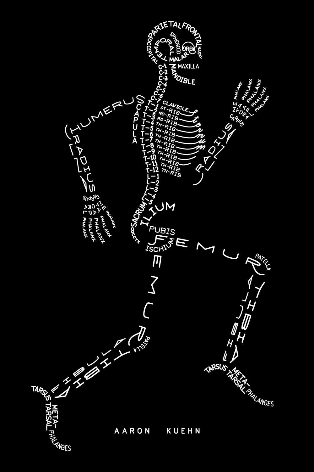
via Aimee via Aaron Kuehn
Typeface Anatomy
Coincidentally, I found a very relevant post on Pintrest today. This week I will be starting the 3rd of my Graphic Design Certificate courses, this one being typography.
Björn Johansson created this very interesting typeface called Typeface Anatomy using the human skeleton as reference.


via Pintrest
Block Type
A really cool set of letters from Marc Böttler.

He uses perspective and depth to turn these rectangular wooden blocks into letters. Check out the K a little closer to see what I mean. (The left half of the letter goes from the ground up while the right side sits entirely on the ground).

via SwissMiss
Type Efficiency
As a great follow up to my previous post, Matt Robinson recently took to drawing on walls to display the ink efficiency of various fonts. After drawing them large scale on a wall, the ink left over in the ball point pens shows how efficient the font are. In an ironic twist, the fonts which were most ink efficient, are lease energy efficient on a computer screen, as the more white the more energy required to light up the screen.

via SwissMiss
Common Fonts Across Different OS
I am looking to embark on a slight redesign of my resumé, a tweaking shall we say. I want to design in a way so that it will come across consistently when viewed on different machines. One of the worst errors to make is using a font that doesn’t come through on other’s machines, followed only slightly behind by using Comic Sans. A quick Google search reveals the 18 “browser-safe fonts”. But don’t forget to read the notes at the bottom! The site also has screen shots from different OS and browsers. Now I just have to decide which one(s) to use!

Cool Typefaces
Andrew Byrom has created some cool typefaces, most not intended to be used in word processors, or even computers for that matter.


—-
via SwissMiss