Archive for the ‘Information Visualization’ Category
Remote Simplification
A year ago I wrote a paper about “Pre-Attentive Processing and Organization of the TiVo DVR Remote Control”, basically how the placement and coloring of buttons on the remote help you to organize them into groups.

When I saw this technique I thought about what it’s like having to use someone else’s remote that you might not be familiar with, especially one that is not designed as well as the TiVo remote. Consider using this for when you have someone over to house sit.
via SwissMiss
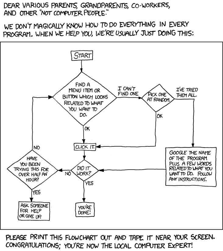
Tech Support Secrets
A lot of people ask me how I’m so good with computers. Leave it to xkcd to reveal my secrets!

via SwissMiss
Illustrating CAPTCHAs
CAPTCHAs are those annoying things that you have to read and then type in order to prove you are in fact human. They are insanely hard, and Audio CAPTCHAs are even more impossible. Perhaps by illustrating them, it will be easier for people to fill in the correct words.
Andrew Wirtanen posted his interpretation of “airlifts john”.
Buzzfeed and Something Awful provide forums for users to post their creations.
Here are some of my favorites:


—-
via Andrew Wirtanen
Excel 2010 Features
Unlike many other people, I love the new Office 2007. I think a big part of that is I actually took the time to figure it all out – the Reference tracker in Word and easy integration between Excel and PowerPoint.
Information is beginning to be released about the new Office 2010, including the fact it will have a free online aspect as well (move aside Google Docs?).
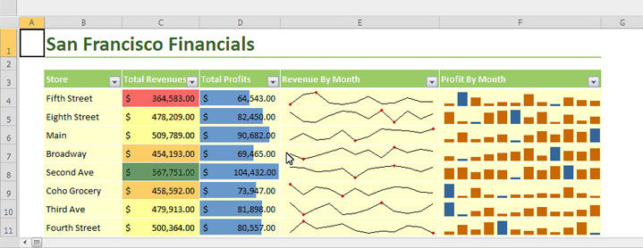
One cool aspect of the new Excel is sparklines “which are essentially tiny charts that appear within a single spreadsheet cell, giving you at-a-glance access to trends”. Seems pretty cool. One bad thing about the charts in Excel have been how they can take over a sheet, so it will be nice to have some graphical information that can be contained to a cell.

—-
via @trokair
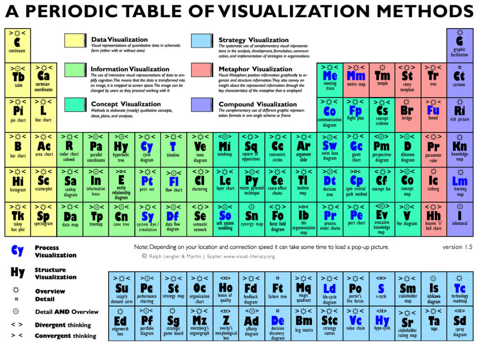
Periodic Table of Visualization Methods
A collection of visualization methods and examples of them. Nice to see them all in one place.

—–
via CoolTools
Cool Infographics Site
Thanks to @awirtanen, I found this site, which also displayed the baseball site which I posted about earlier: Information Aesthetics.
Pass the Ball
A classic test of awareness, used to promote a campaign to raise awareness for cyclists in the UK. The original:
[youtube=http://www.youtube.com/watch?v=Ahg6qcgoay4]
And they have also made others similar to this. This one was my favorite:
[youtube=http://www.youtube.com/watch?v=ubNF9QNEQLA]
Appropriate Contrast?
CheckMyColours.com is a site which evaluates the contrast of the colors on a particular site. It’s another tool to be added when designing a site. Don’t go just on the number of failures. Look at where you’re failing; that font may not end up on your site, depending on how you code.
—–
via SwissMiss
Baseball Visualizations
Came across a site that blends two of the things I love: baseball and visualizations. Flip Flop Fly Ball is a collection of baseball and sports visualizations.
Do you know which one is Fenway? Do you know any others?
—–
via centerfield
