Archive for the ‘maps’ tag
A Day In the Life of MBTA Buses
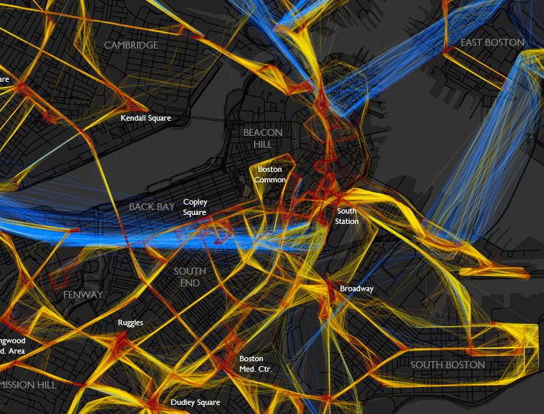
A beautiful depiction of the location/speed of MBTA buses from last Friday. Bostonography used the NextBus data to create this map of the bus routes. The colors indicate the speed the bus is traveling: blue = >25 MPH, yellow = 10-25 MPH and red = <10 MPH. The lack of blue frightens me! I will continue to be glad that I neither have to drive nor take a bus in downtown Boston very often.
(click image to see full map)
For the most part buses on this day had average speeds predictably somewhere below the normal city street speed limit, with the very slow spots being around major intersections and hubs like Ruggles or Harvard Square. There are also some generally slow areas besides those, such as most of downtown. As you can see, most of the MBTA system would be toast if faced with the classic Speed scenario. The “fast” (and remember this category goes all the way down to 25 mph) lines are mostly confined to the rush hour expressway routes and some suburban roads. I expected to see more red than there is, though. I don’t often ride the bus, but the experiences burned in my mind are things like watching pedestrians cross the Mass Ave bridge more quickly than my #1. – Andy Woodruff
It would be interesting to include more data and create an interactive model to show patterns over days/weeks for certain times or events. (I’m sure a Red Sox game would create a lot more red in the Fenway area!) This really makes me want to take some cartography classes!
via @mbtaGM
Boston is a College Town
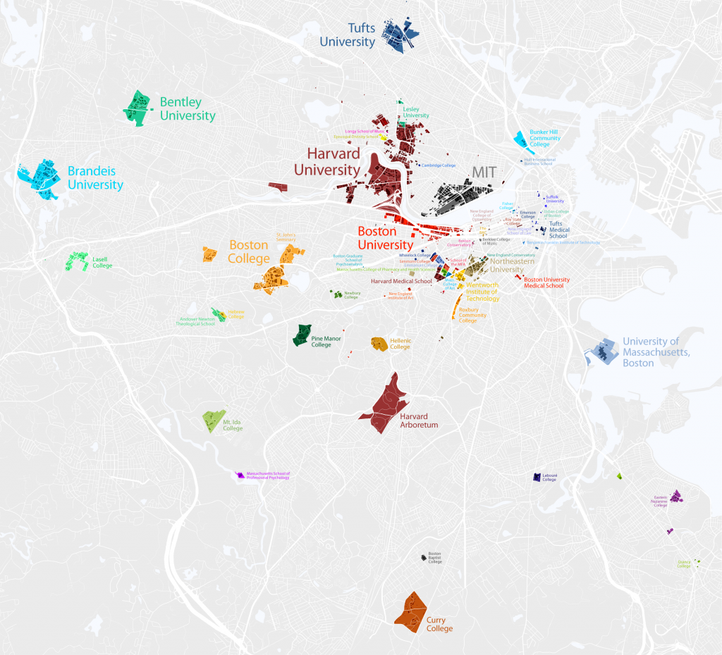
In case you didn’t know, Boston is a college town. Since I’m a visual person, I appreciated the map that Bill Rankin created of colleges inside the 128 belt. Upon further inspection, I realized that he had forgotten Bentley’s North Campus, but I think we can give him the benefit of the doubt for the other schools.
A very cool visualization indeed! (Click image to enlarge.)
via @chatzy84
Analyzing the Digital Maps
Came across this great article on 41Latitude which compares Google Maps’ labels (left) with Bing (right) and MapQuest. It’s interesting to compare the maps side to side. I strictly use Google Maps, for not only a better mapping service, but also because it’s just easier!
The author’s first hypothesis is that Google Maps has a lesser density of labels when compared to the other maps. However, when looking at the area shown above, Google had 86 city labels, Bing had 91, and MapQuest had 83. So that is not the reason for GMap’s superiority.
One of the 3 reasons Justin O’Beirne gives for the Google Maps’ legibility is the fact that they have non-opaque white outlines around the labels. The images below show Google Maps (left) and MapQuest.
As you can see, Yahoo!’s decision to allow background map information to remain visible underneath its city labels harms their overall legibility. Individual letters are broken up by other dark lines, forcing users to give a second look to many labels.
The second reason he gives is the greater number of “classes” of labels for cities. (Think CSS headings). Google maps has 4 different sizes of labels while Bing and MapQuest only have 3. The third reason he gives is the fact that the smaller labels are shown in a lighter color, which makes them fade slightly into the background.
Additionally, a few “tricks” are pointed out – not necessarily related to the labels – that help with Google Maps’ readability. The first is label decluttering around major metropolitan areas, basically smaller suburbs aren’t shown. Also, Google displays city markers further apart than Bing (not that it is moving cities, just that it is showing cities that are father apart from each other).
In conclusion, Google Maps is better. Although I guess I should say Bing has addressed some of the issues pointed out in the critique.
via ChartPorn
The United States of Autocomplete
Very Small Array has created a map of the United States which includes one of the suggested autocomplete phrases that comes up after typing in that state. It’s not clear if they were the first ones or specifically selected ones. The comments on the post indicate that a lot of people had different suggestions, but the idea is still really cool!
via FlowingData


