Archive for the ‘visibility’ tag
Analyzing the Digital Maps
Came across this great article on 41Latitude which compares Google Maps’ labels (left) with Bing (right) and MapQuest. It’s interesting to compare the maps side to side. I strictly use Google Maps, for not only a better mapping service, but also because it’s just easier!
The author’s first hypothesis is that Google Maps has a lesser density of labels when compared to the other maps. However, when looking at the area shown above, Google had 86 city labels, Bing had 91, and MapQuest had 83. So that is not the reason for GMap’s superiority.
One of the 3 reasons Justin O’Beirne gives for the Google Maps’ legibility is the fact that they have non-opaque white outlines around the labels. The images below show Google Maps (left) and MapQuest.
As you can see, Yahoo!’s decision to allow background map information to remain visible underneath its city labels harms their overall legibility. Individual letters are broken up by other dark lines, forcing users to give a second look to many labels.
The second reason he gives is the greater number of “classes” of labels for cities. (Think CSS headings). Google maps has 4 different sizes of labels while Bing and MapQuest only have 3. The third reason he gives is the fact that the smaller labels are shown in a lighter color, which makes them fade slightly into the background.
Additionally, a few “tricks” are pointed out – not necessarily related to the labels – that help with Google Maps’ readability. The first is label decluttering around major metropolitan areas, basically smaller suburbs aren’t shown. Also, Google displays city markers further apart than Bing (not that it is moving cities, just that it is showing cities that are father apart from each other).
In conclusion, Google Maps is better. Although I guess I should say Bing has addressed some of the issues pointed out in the critique.
via ChartPorn
Can you paint with all the Colors of the Wind?
Color plays a vital role in a lot of things that we do.
The SAP Design Guild has an article about all things color. It is basically an overview of all that can go good and bad with color including chromostereoopis, lateral inhibition, and subjective contours.
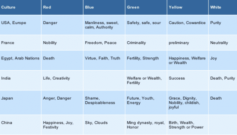
As I’m sure we all learned in English class at one point that a word can have a connotative and denotative meaning. The way that I learned it was that red was the color of an apple (denotative) and also meant danger (connotative). This chart (from SAP Design Guild) shows the connotative meaning for colors across different cultures.

But what about those people who cannot see color [about 8% of the male population and some smaller % of the female population]? WeAreColorblind.com provides patterns for designing with colorblindness in mind. They also provide tools and examples of good design and poor design.
Pass the Ball
A classic test of awareness, used to promote a campaign to raise awareness for cyclists in the UK. The original:
[youtube=http://www.youtube.com/watch?v=Ahg6qcgoay4]
And they have also made others similar to this. This one was my favorite:
[youtube=http://www.youtube.com/watch?v=ubNF9QNEQLA]


