A New Measuring Cup
I often write about people seeing a problem and fixing it – and that’s exactly what Josh Redstone did with the Euclid measuring cup. With a narrower base, the cup allows you to get a more precise liquid measurement than the traditional measuring cup. The animated GIF below shows you the increased error rate for a traditional cup.
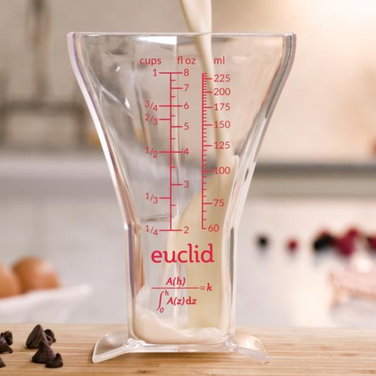

You can support this project over on Kickstarter and get your own measuring cup for a pledge of $24.
via @Mental_Floss
Skeleton Graphic – with words
Came across this cool graphic of a skeleton which reminded me a lot of an assignment we had in Type Class where we had to construct a portrait of an artist using their song lyrics. Anyway, this is a great reference for anyone learning the bones in the body!!
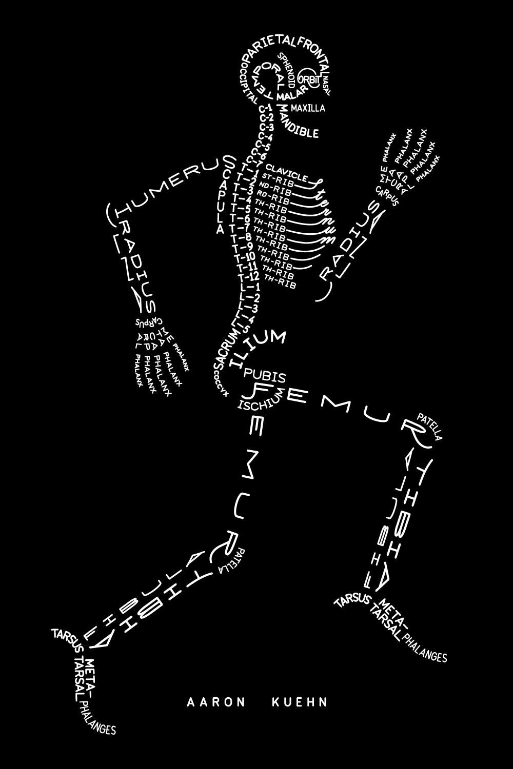
via Aimee via Aaron Kuehn
15 Sorting Algorithms Vizualized
Timo Bingmann has created a visualization of various sorting algorithms. At the end of each segment, the different bars are arranged in a smallest–> largest order.
Until watching this video I wasn’t really aware that there were different methods that computers used for sorting numbers, but I guess it would make sense!
A quick Google search has revealed a 30,000 ft. view of algorithms from Lydia Sinapova. If you’re so inclined, you can also check out the Wikipedia page.
The algorithms in the video are:
|
|
How Common is Your Birthday?
I know a ton of people born in May – but apparently most people are born during the summer months. The Daily Viz presents a lovely visual representation of which days have the most births. You can see the not-so-lovely data table over on NYTimes.

via @BrainPicker
Underwater “Attack” Dog Photos
Little Friends Photos has managed to capture dogs looking as mean and frightening as sharks. Some of these are seriously scary. Maybe sharks wouldn’t be as scary if they were on land? Happy to see these pooches are attacking nothing more than a fetch ball.


via Pintrest
Three Primary Colors
OK Go teamed up with Sesame Street to create a stop-motion video about colors. This song is so catchy! It’s been in my head for the whole weekend! Also, I am loving OK Go’s creativity lately. Also check out their new music video for Needing/Getting where they did some stunt driving while still playing instruments.
via SwissMiss
The Meanings of Logos – According to a 5 year old
Adam Ladd is an identity designer who decided to ask his 5-year-old about different logos. She recognizes some and others she deduces the meaning of based on what she sees. Very clever. I will have to try this with some kids I know!
via SwissMiss
Typeface Anatomy
Coincidentally, I found a very relevant post on Pintrest today. This week I will be starting the 3rd of my Graphic Design Certificate courses, this one being typography.
Björn Johansson created this very interesting typeface called Typeface Anatomy using the human skeleton as reference.


via Pintrest
Stamping with Lego
I have always kind of been obsessed with Legos. I have plans to create a stop motion animation video with them someday and once tried to draw one, but I didn’t get very far with that. I recently came across a cool art project with Legos that involved a lot less effort/knowledge than the aforementioned tasks. This involves lego pieces and ink, basically using the Lego pieces as stamps! There were some very cool patterns created and I can’t wait to get some ink and start playing around with what you can create!


Perhaps even the stop motion and stamping techniques can be combined?
via Pintrest