Archive for the ‘Information Visualization’ Category
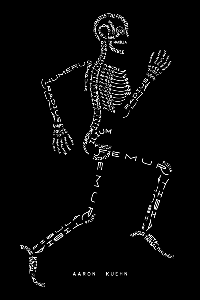
Skeleton Graphic – with words
Came across this cool graphic of a skeleton which reminded me a lot of an assignment we had in Type Class where we had to construct a portrait of an artist using their song lyrics. Anyway, this is a great reference for anyone learning the bones in the body!!
via Aimee via Aaron Kuehn
15 Sorting Algorithms Vizualized
Timo Bingmann has created a visualization of various sorting algorithms. At the end of each segment, the different bars are arranged in a smallest–> largest order.
Until watching this video I wasn’t really aware that there were different methods that computers used for sorting numbers, but I guess it would make sense!
A quick Google search has revealed a 30,000 ft. view of algorithms from Lydia Sinapova. If you’re so inclined, you can also check out the Wikipedia page.
The algorithms in the video are:
|
|
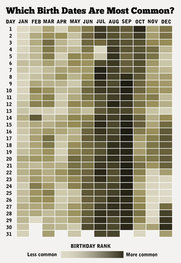
How Common is Your Birthday?
I know a ton of people born in May – but apparently most people are born during the summer months. The Daily Viz presents a lovely visual representation of which days have the most births. You can see the not-so-lovely data table over on NYTimes.
via @BrainPicker
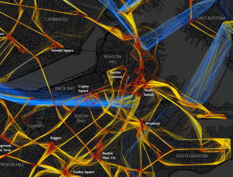
A Day In the Life of MBTA Buses
A beautiful depiction of the location/speed of MBTA buses from last Friday. Bostonography used the NextBus data to create this map of the bus routes. The colors indicate the speed the bus is traveling: blue = >25 MPH, yellow = 10-25 MPH and red = <10 MPH. The lack of blue frightens me! I will continue to be glad that I neither have to drive nor take a bus in downtown Boston very often.
(click image to see full map)
For the most part buses on this day had average speeds predictably somewhere below the normal city street speed limit, with the very slow spots being around major intersections and hubs like Ruggles or Harvard Square. There are also some generally slow areas besides those, such as most of downtown. As you can see, most of the MBTA system would be toast if faced with the classic Speed scenario. The “fast” (and remember this category goes all the way down to 25 mph) lines are mostly confined to the rush hour expressway routes and some suburban roads. I expected to see more red than there is, though. I don’t often ride the bus, but the experiences burned in my mind are things like watching pedestrians cross the Mass Ave bridge more quickly than my #1. – Andy Woodruff
It would be interesting to include more data and create an interactive model to show patterns over days/weeks for certain times or events. (I’m sure a Red Sox game would create a lot more red in the Fenway area!) This really makes me want to take some cartography classes!
via @mbtaGM
Visualizing Population Growth
Last week the world’s population reached 7 billion people. NPR had an interesting approach to illustrate how our population has grown so large using water dripping into and coming out of a hole on the bottom of a glass.
via Sarah Brown
Boston Map
This poster by Ork Posters of the Boston neighborhoods is pretty cool! I always get confused as to what is actually a part of Boston and what isn’t. This is helpful and interesting to look at all at the same time!
via beaktweets
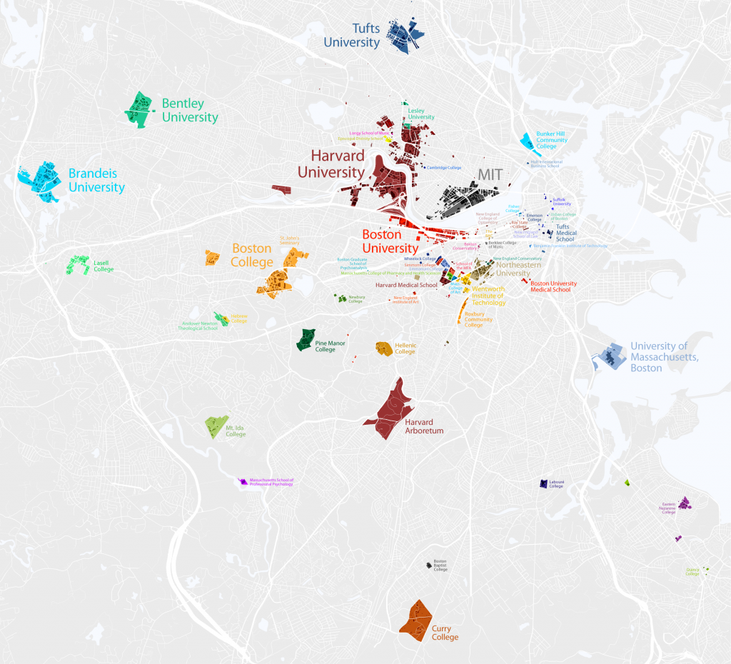
Boston is a College Town
In case you didn’t know, Boston is a college town. Since I’m a visual person, I appreciated the map that Bill Rankin created of colleges inside the 128 belt. Upon further inspection, I realized that he had forgotten Bentley’s North Campus, but I think we can give him the benefit of the doubt for the other schools.
A very cool visualization indeed! (Click image to enlarge.)
via @chatzy84
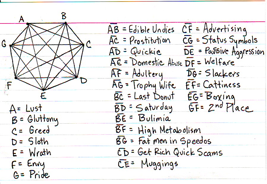
Interpreting the Seven Deadly Sins
Jessica Hagy presented an interesting look at the seven sins and what represents the areas that they overlap.
via Chart Port
The United States of Shame / The United States of Awesome
A little while back I posted a map of The United States of Autocomplete. I now present you with two new interpretations of a map of the US. These are the things states are the worst at (from pleated jeans) and what your state does really well (from Political Language). I’m a born and bred Masshole Massachusett and I am guilty/proud of embodying both what Mass is worst at (bad driving) and what Mass is good at (college graduates).
It’s funny to see how some of them match.
NY (clearly influenced by NYC): Worst Daily Commute = Awesome Transit Use.
Utah: Most Liberalized Prostitution Laws = Worst Crime
North Carolina: Worst Teacher Salaries = Best Value University
Michigan: Best Freshwater Access = Highest Unemployment
via FlowingData
Don’t Touch That!
You’ll get your fingerprints all over my …….!
Well, George Kokkinidis at Design Language News decided that he was going to do just that! He wiped clean his iPad and started using an app (being sure to get his fingerprints on the screen) and then photographed his fingerprints on the screen.
Can you tell what apps he’s using in these two examples?
Hit the jump to see the answer and the rest of the apps.
