Archive for the ‘poster-design’ tag
Flyer Goodness
I came across this great blog while I was searching for some inspiration for a project for my graphic design class. Flyer Goodness explain that…
Flyer Goodness is a flyer design blog dedicated to highlighting disposable art — masterpieces that are thrown in the garbage, rained on, and plastered over in less than a week.
Some of my favorites are below. (The images link to the post that includes that poster.)
Poster Design
Tutorial Lounge has provided a tutorial of “tips and tricks” to poster design.
Posters are designed to communicate a message and to cause great impact on the onlooker, however, this too is a fact that neither a passersby nor a driver will stop to read them and consume the message being conveyed. So in order to make the posters more communicating, they should be precise regarding the message, colors and the elements being used to convey it.
Their first tip is to consider the message, as it’s the most important part of the poster (really the only reason for it’s creation).
The next tip is to be creative and unique to make sure the viewer remembers your poster, and specifically the message.
Thirdly, there must be an appropriate aesthetic for the message conveyed. “For instance, if the product or revolves around a serious and decent message, you cannot put funky images or highly colorful layout for the poster.” They continue to talk of color choices, information hierarchy, composition and the emotional element.
They also suggest that you take into account where your poster will be placed in order to fit with that area’s aesthetic and be noticed.
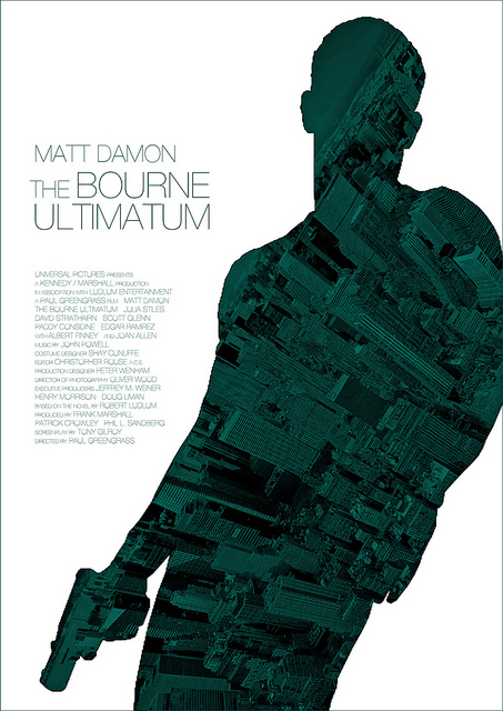
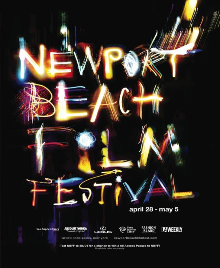
Here are some of the examples of the poster designs shown in the article:
via @DesignModo


