Archive for the ‘organization’ tag
15 Sorting Algorithms Vizualized
Timo Bingmann has created a visualization of various sorting algorithms. At the end of each segment, the different bars are arranged in a smallest–> largest order.
Until watching this video I wasn’t really aware that there were different methods that computers used for sorting numbers, but I guess it would make sense!
A quick Google search has revealed a 30,000 ft. view of algorithms from Lydia Sinapova. If you’re so inclined, you can also check out the Wikipedia page.
The algorithms in the video are:
|
|
Carabiner Key
In high school I didn’t have my own car. I shared the 2 family cars with my parents, which meant I had 2 keys for the cars as well as a house key and a key to my employer’s office. This made for a lot of keys. I soon realized that I could use a carabiner to manage them all without weighing me down! I still use one now.
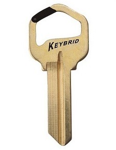
Now I have all of my individual keys on their own ring and I use the rings to add/remove the keys. Well, Scott Amron has come up with the Carabiner Key. You can currently place an order for one, although there’s no price listed on the site. And don’t worry, for those of you who aren’t into the whole carabiner thing, he also has the Split Ring Key. I personally don’t like to damage my fingernails every time I need to change the keys on my keyring.
via @wired
Grip Limited
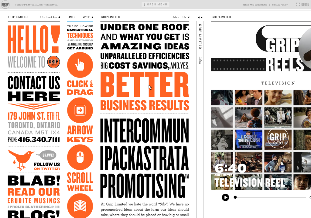
Listed as a website with unusual navigation, Grip Limited has an unusual website period! But it’s pretty cool, although not necessarily the most usable thing in the world. Let me attempt to explain it to you:
The website is basically a big table with one row and multiple columns. The columns each scroll independently, but are fixed to be the height of the page. There’s a menu at the top of the page, which expands down, but it’s not really that helpful unless you’re looking for a specific project that they worked on.
As far as navigation is concerned: you can use your mouse to grab and move left and right as well as up and down within a column; similarly you can use your arrow keys to move left and right across the columns and up and down the active column. Also, you can use your scroll wheel to move up and down the column. You can collapse columns by pushing the Space key or by clicking on the column header. If you forget any of this, you can reference the second column, appropriately called “OMG WTF”.
Go check it out:
via @mlane
UPDATE 6/2: GripLimited has won a Webby. For what you ask? “Best Navigation and Structure”. If you’re asking “WTF?” then have a look over at UXMagazine’s article on the matter…
Analyzing the Digital Maps
Came across this great article on 41Latitude which compares Google Maps’ labels (left) with Bing (right) and MapQuest. It’s interesting to compare the maps side to side. I strictly use Google Maps, for not only a better mapping service, but also because it’s just easier!
The author’s first hypothesis is that Google Maps has a lesser density of labels when compared to the other maps. However, when looking at the area shown above, Google had 86 city labels, Bing had 91, and MapQuest had 83. So that is not the reason for GMap’s superiority.
One of the 3 reasons Justin O’Beirne gives for the Google Maps’ legibility is the fact that they have non-opaque white outlines around the labels. The images below show Google Maps (left) and MapQuest.
As you can see, Yahoo!’s decision to allow background map information to remain visible underneath its city labels harms their overall legibility. Individual letters are broken up by other dark lines, forcing users to give a second look to many labels.
The second reason he gives is the greater number of “classes” of labels for cities. (Think CSS headings). Google maps has 4 different sizes of labels while Bing and MapQuest only have 3. The third reason he gives is the fact that the smaller labels are shown in a lighter color, which makes them fade slightly into the background.
Additionally, a few “tricks” are pointed out – not necessarily related to the labels – that help with Google Maps’ readability. The first is label decluttering around major metropolitan areas, basically smaller suburbs aren’t shown. Also, Google displays city markers further apart than Bing (not that it is moving cities, just that it is showing cities that are father apart from each other).
In conclusion, Google Maps is better. Although I guess I should say Bing has addressed some of the issues pointed out in the critique.
via ChartPorn
Google Wave, demystified
What’s all the fuss about Google Wave? This video explains it. It seems like it is smashing GMail with Google Docs and MS Word’s “track changes”.
UPDATE: 11/22/2009
I have received my Google Wave invite (thanks to Kyle Bedell). But I’m not really sure what to do with it. I don’t really send e-mails to groups at this point in my life. I basically use gmail for personal communication and to get updates on geocaching and other listservs. It is blocked at work, so I couldn’t use it for that purpose even if I wanted to. I’ll have to recruit a friend to try it out with me.
—-
via SwissMiss
Remote Simplification
A year ago I wrote a paper about “Pre-Attentive Processing and Organization of the TiVo DVR Remote Control”, basically how the placement and coloring of buttons on the remote help you to organize them into groups.

When I saw this technique I thought about what it’s like having to use someone else’s remote that you might not be familiar with, especially one that is not designed as well as the TiVo remote. Consider using this for when you have someone over to house sit.
via SwissMiss
Excel 2010 Features
Unlike many other people, I love the new Office 2007. I think a big part of that is I actually took the time to figure it all out – the Reference tracker in Word and easy integration between Excel and PowerPoint.
Information is beginning to be released about the new Office 2010, including the fact it will have a free online aspect as well (move aside Google Docs?).
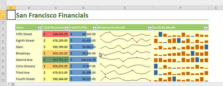
One cool aspect of the new Excel is sparklines “which are essentially tiny charts that appear within a single spreadsheet cell, giving you at-a-glance access to trends”. Seems pretty cool. One bad thing about the charts in Excel have been how they can take over a sheet, so it will be nice to have some graphical information that can be contained to a cell.

—-
via @trokair


