Archive for the ‘web-development’ tag
Grip Limited
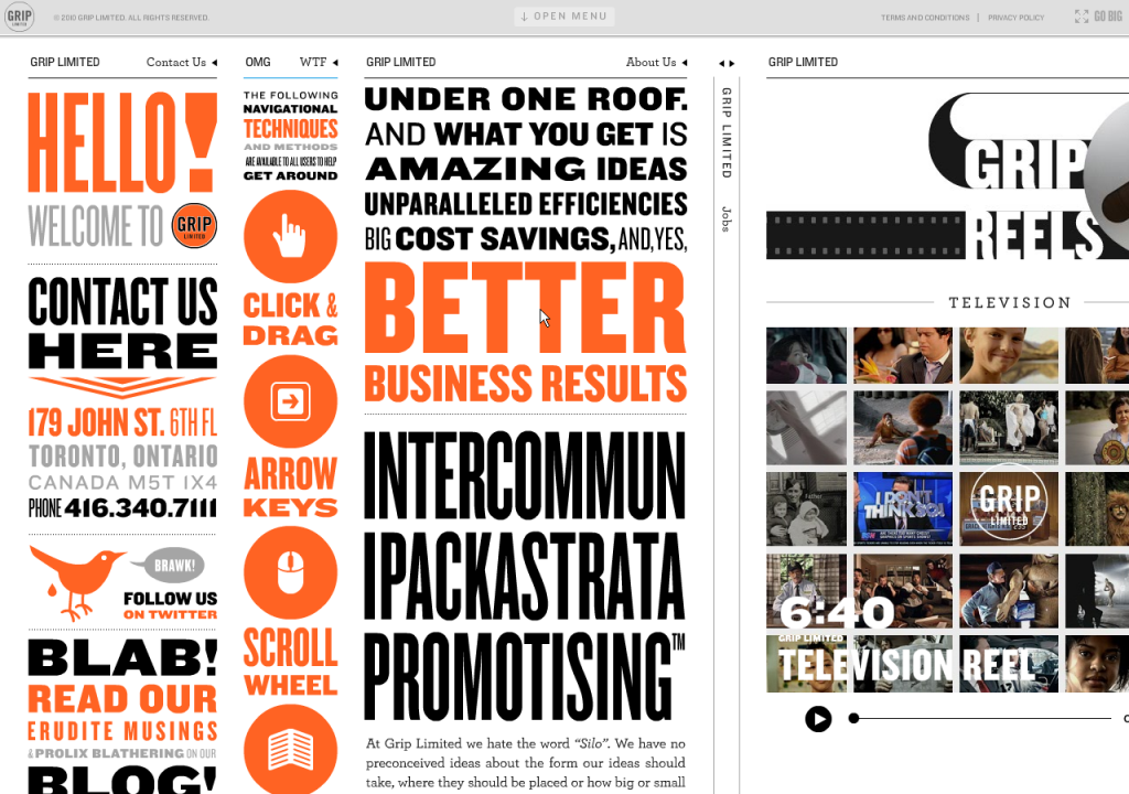
Listed as a website with unusual navigation, Grip Limited has an unusual website period! But it’s pretty cool, although not necessarily the most usable thing in the world. Let me attempt to explain it to you:
The website is basically a big table with one row and multiple columns. The columns each scroll independently, but are fixed to be the height of the page. There’s a menu at the top of the page, which expands down, but it’s not really that helpful unless you’re looking for a specific project that they worked on.
As far as navigation is concerned: you can use your mouse to grab and move left and right as well as up and down within a column; similarly you can use your arrow keys to move left and right across the columns and up and down the active column. Also, you can use your scroll wheel to move up and down the column. You can collapse columns by pushing the Space key or by clicking on the column header. If you forget any of this, you can reference the second column, appropriately called “OMG WTF”.
Go check it out:
via @mlane
UPDATE 6/2: GripLimited has won a Webby. For what you ask? “Best Navigation and Structure”. If you’re asking “WTF?” then have a look over at UXMagazine’s article on the matter…
The Wilderness Downtown
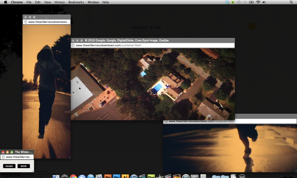
My professor showed me this Chrome Experiment called The Wilderness Downtown. It is an experimental video by Chris Milk which taps into some of the interesting potential of HTML5 and Google Chrome.
In order to get started you’ve got to provide an address. It asks for your childhood home, but you can put in any address (HINT: Provide an address with good Google Maps/Street View coverage.) From there, you’re taken on a journey of sorts. Just turn on your speakers, sit back, and enjoy the ride.
Try it for yourself! I would assume it works best in Chrome, which if you aren’t using it, you should be.
HTML5
I consider myself to be somewhat of a freelance web designer. I’ve created my own website and some websites for friends and family. There’s been a lot of talk about HTML5 and how it’s going to change the world. I’ve been a little late to the game in this new language. Thanks to @taliabethralph I came across html5rocks.com which has implemented some new features and demonstrates them in their slideshow.
It all seems very cool, the ability to have rounded corners and especially the ability to have any font face, regardless of if it’s supported on the users’ computer. I’m hoping that when I take Web Design as part of my Graphic Designer Certificate at SMFA they will cover HTML5 in depth. I look forward to implementing these in my websites and creating some new ones as well!
You Offer a Mobile Site?
Great! You don’t have to advertise your mobile site to me on your website, just take me to it when I’m on my mobile phone!
 While checking out the Staples Center website I came across this indicator on the top right of their site. Really?! Isn’t it kind of a given that you have a mobile site? And why do you need to indicate this to people on your main website? Shouldn’t your technology be good enough that you can notice that I’m on a mobile device and just bring me to your mobile site? It’s not like I’m going to visit your site from my computer.
Well, now my post could end here. A simple gripe about how people just don’t get mobile sites. But, I’m going to take it one step further, and expand upon the implementation of mobile site. I actually visited the mobile site from my computer, just to see what it was like. (Now, as a note, I kind of feel bad picking on the Staples Center but #1, the Lakers play there and #2, it just happens to be the one site that I’ve visited recently like this. I’m sure there are many, many others out there.)
Here is the header from www.StaplesCenter.com.
And now the landing page for mobile.StaplesCenter.com
Why is this a problem?
Since getting my Droid back in February, I’ve been using my PC less and less. (Note: I’ll be getting a Mac very soon and hopefully I’ll be using it more since it’ll be AWESOME!) Perhaps I’m expecting too much from mobile sites, but I expect to be able to do pretty much everything I can do on the “normal” site, just faster and easier and with less clutter. Actually, designing web sites optimized for mobile could actually be a good direction for designers to head. But I digress. Why should I have to suffer with reduced functionality and features just because I’m using a “phone”? It just doesn’t seem fair.
Now I could understand this approach 4 years ago when people were accessing the Internet from their Moto RAZRs with small screens and slow networks. But today’s phones are much more powerful than computers were just a few years ago.
One other thing about mobile sites that annoying me just as much as reduced functionality is the inability to zoom! Why must you fix the width to my phone? Sometimes I need to see the words a little bit bigger. WordPress Blogs (including my own) and Mashable are two sites that come to mind.
Do you have any sites that you use that are like this? Any other gripes you have about navigating the Web on your phones?
Appropriate Contrast?
CheckMyColours.com is a site which evaluates the contrast of the colors on a particular site. It’s another tool to be added when designing a site. Don’t go just on the number of failures. Look at where you’re failing; that font may not end up on your site, depending on how you code.
—–
via SwissMiss


