Archive for the ‘Usability’ Category
“PEOPLE WHO SEARCHED FOR DOOR ALSO SEARCHED FOR”
Thank you AltaVista (essentially Yahoo) for suggesting that my search for “door” also lead me to search for Hugh Laurie.
Poor Button Placement
Radmin posted this rather unfortunate placement of a laptop’s power button.

Although this could be a lot worse, it still isn’t a good idea to put the power button so close to another button. I hit ESC often – like to close out of full-screen – and I don’t want to close anything let alone shut the computer off.
Take a look at a good example of power button placement, the Apple Macbook Pro:
I do understand that sometimes there isn’t always enough room to play around with, the designers should take care to be sure the power button isn’t hit accidentally. I know they usually have a time limit that you need to push the button before it actually takes action. Just keep this in mind when you’re searching for a new computer. This isn’t something that you usually take into account.
via Core77
Analyzing the Digital Maps
Came across this great article on 41Latitude which compares Google Maps’ labels (left) with Bing (right) and MapQuest. It’s interesting to compare the maps side to side. I strictly use Google Maps, for not only a better mapping service, but also because it’s just easier!
The author’s first hypothesis is that Google Maps has a lesser density of labels when compared to the other maps. However, when looking at the area shown above, Google had 86 city labels, Bing had 91, and MapQuest had 83. So that is not the reason for GMap’s superiority.
One of the 3 reasons Justin O’Beirne gives for the Google Maps’ legibility is the fact that they have non-opaque white outlines around the labels. The images below show Google Maps (left) and MapQuest.
As you can see, Yahoo!’s decision to allow background map information to remain visible underneath its city labels harms their overall legibility. Individual letters are broken up by other dark lines, forcing users to give a second look to many labels.
The second reason he gives is the greater number of “classes” of labels for cities. (Think CSS headings). Google maps has 4 different sizes of labels while Bing and MapQuest only have 3. The third reason he gives is the fact that the smaller labels are shown in a lighter color, which makes them fade slightly into the background.
Additionally, a few “tricks” are pointed out – not necessarily related to the labels – that help with Google Maps’ readability. The first is label decluttering around major metropolitan areas, basically smaller suburbs aren’t shown. Also, Google displays city markers further apart than Bing (not that it is moving cities, just that it is showing cities that are father apart from each other).
In conclusion, Google Maps is better. Although I guess I should say Bing has addressed some of the issues pointed out in the critique.
via ChartPorn
UX Designers
A brilliant video about UX Designers (although not one, I am working towards pretending to be one) by lyle.
via @Amy_Liz
LivingSocial Amazon.com Deal
You may or may not have heard of Groupon or the idea of it. But basically, it’s a service that offers (usually) daily coupons on various things, restaurants, spas, golfing lessons, gift certificates. One example is a $40 gift card to a local restaurant for $20 that expires in 3 months. It works for the restaurant, because it might get some new customers into their restaurant and it works for current customers because they get something at a discount.
Well, yesterday LivingSocial offered a deal for an Amazon gift card at 50% off. A $20 gift card for $10 with no expiration. Too good to be true? Well, maybe. They’re definitely losing money on the deal. By the end of the day, over 1.3 million coupons were sold.
So why do something like this? Well, they’re currently losing to Groupon (or at least they were). According to Website Magazine, as of September 2010, Groupon had 40% of coupon seeking traffic while LivingSocial had 20%. I’m sure that this not only increased traffic but it also increased LivingSocial’s member base and awareness in the marketplace. I bought the deal. How could you not? And I told my friends and my mom. My mom had never heard of things like this. Well now she knows, and now she’s bought one. And I can pretty much guarantee she’s going to buy another and maybe even more than that. So how much will the dropped $10 on her first LivingSocial purchase actually net for the company? Probably more than $10.
Now, since we’re on the topic, I am not very happy with LivingSocial’s website. Here’s just a few reasons why:
- It caches your location. So if you go in and are on a national deal page, it thinks your in D.C., even if you’ve set your preferred city. This is the cause for the other two gripes:
- Why is the above deal showing for Washington, D.C.? I am not near Washington, D.C. I’m signed in and have set my preferred city. I get it’s a national deal, so show the USofA!
- When you go to LivingSocial.com, it actually takes you to the 3rd link on the left navigation list (URL: http://livingsocial.com/deals/how_it_works). Why? Why tell me how it works? I’m already signed in, I’ve already bought a deal. Just show me today’s deal!
- I still haven’t gotten my deal!
So what are we to do now? Well, I guess we’ll just wait and see what they follow up Amazon’s deal with. Today, LivingSocial has a European Restaurant in Brighton while Groupon has Indian and Nepal Cuisine in Somerville.
So what else is there?
Photojojo’s “CAPTCHA”
I recently purchased the t-shirt that I mentioned in “Lens Bracelets” from Photojojo. Whether it was due to user error or a usability issue (not important in this story) I accidentally switched up my billing address and shipping address. When I got my confirmation e-mail I noticed this and proceeded to contact them to change it.
When I clicked on the “Contact Us” link in the e-mail I arrived at a simple form to submit a question to them. However, what wasn’t simple was their way of verifying that I was in fact human. Instead of using a CAPTCHA – as most websites do – they were able to incorporate their specialty (photography) and also not have to annoy their customers by being unable to read the letters. My only question is if it’s just as effective at stopping spam.
Eye- [am] Tracking Your Lies
Researchers at the University of Utah have been working on a way to determine if someone is lying based on their eye movements and pupil dilation. Now, for anyone who watches Lie To Me, they won’t be surprised by this, since Lightman could read a guy who was paralyzed completely (not sure how he couldn’t blink, but this is TV). He used his pupil size to determine if he was telling the truth, yes or no. Although, we can’t believe everything we see on TV it seems like these folks have a real-life solution in the works.
In terms of the implication for usability testing, I wonder if people would be less likely to agree to being “eye-tracked” if they’re aware that the technology can be used to determine if they’re lying. Then again, for usability practitioners, we could use this to determine if users are telling the truth when they say the site is easy to use.
via @therealmasoud via @customerexplabs
Tag Cloud Creators
Recently I had a need to create some tag clouds. I came across a number of different tools. As I discovered each of them, I kept finding a better alternative. Below I’ve provided some information about 3 different tools which will allow you to create tag clouds. Happy creation!
Lack of Consistency in Photoshop CS4
Although I have yet to have time to immerse myself in CS4, I ran across a post by Neven Mrgan showing the different slider bars found in Photoshop CS4. Below are a sampling…
 It is a general guideline, that a similar design be used when the user is performing the same or similar action. Usability.gov’s guideline states “Allow users to perform tasks in the same sequence and manner across similar conditions” (Guideline 2:3).
In the case of the sliders, it is unnecessary to have multiple designs for the same control. The first three sliders are all performing the same purpose, to allow the user to select a value from a range of numbers. They each show the title, the value, and the slider.
The 4th slider is slightly different and shows the blending of two layers, and therefore needs an additional slider control. There is little to no reason for there to be different arrows.
The only slider pictured here that I can make a justification for variation is the last one. The blending of the two colors along the slider is helpful in determining the desired color mix.
I’m unsure why all the inconsistency in the design of this great program. It seems as though they’ve kept sliders from previous versions and improved upon them as new features were included, but never took the time to update the old ones. Hopefully by the time the next version comes along they’ll have taken the time to not only include some amazing new features (content-aware scaling comes to mind) but also improve the ease of use of the system by sticking to some well-established guidelines.
—-
via SwissMiss
Samsung Dual View TL220
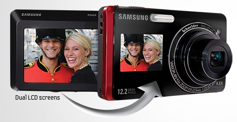
Find a problem, and create a design to fix it. That’s exactly what the people at Samsung have done. Presenting the Dual View TL222:
I mean, I’m sure we’ve all taken a photo of ourselves and others and tried to guess or not if we’re in the frame. The only bad thing about this is that the advertisement doesn’t depict this self-photo taking…


