Archive for the ‘color’ tag
Lack of Consistency in Photoshop CS4
Although I have yet to have time to immerse myself in CS4, I ran across a post by Neven Mrgan showing the different slider bars found in Photoshop CS4. Below are a sampling…
 It is a general guideline, that a similar design be used when the user is performing the same or similar action. Usability.gov’s guideline states “Allow users to perform tasks in the same sequence and manner across similar conditions” (Guideline 2:3).
In the case of the sliders, it is unnecessary to have multiple designs for the same control. The first three sliders are all performing the same purpose, to allow the user to select a value from a range of numbers. They each show the title, the value, and the slider.
The 4th slider is slightly different and shows the blending of two layers, and therefore needs an additional slider control. There is little to no reason for there to be different arrows.
The only slider pictured here that I can make a justification for variation is the last one. The blending of the two colors along the slider is helpful in determining the desired color mix.
I’m unsure why all the inconsistency in the design of this great program. It seems as though they’ve kept sliders from previous versions and improved upon them as new features were included, but never took the time to update the old ones. Hopefully by the time the next version comes along they’ll have taken the time to not only include some amazing new features (content-aware scaling comes to mind) but also improve the ease of use of the system by sticking to some well-established guidelines.
—-
via SwissMiss
Can you paint with all the Colors of the Wind?
Color plays a vital role in a lot of things that we do.
The SAP Design Guild has an article about all things color. It is basically an overview of all that can go good and bad with color including chromostereoopis, lateral inhibition, and subjective contours.
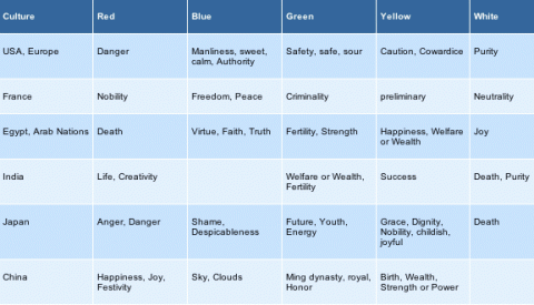
As I’m sure we all learned in English class at one point that a word can have a connotative and denotative meaning. The way that I learned it was that red was the color of an apple (denotative) and also meant danger (connotative). This chart (from SAP Design Guild) shows the connotative meaning for colors across different cultures.

But what about those people who cannot see color [about 8% of the male population and some smaller % of the female population]? WeAreColorblind.com provides patterns for designing with colorblindness in mind. They also provide tools and examples of good design and poor design.
Appropriate Contrast?
CheckMyColours.com is a site which evaluates the contrast of the colors on a particular site. It’s another tool to be added when designing a site. Don’t go just on the number of failures. Look at where you’re failing; that font may not end up on your site, depending on how you code.
—–
via SwissMiss