Archive for the ‘Information Visualization’ Category
BOO!
Well, as you know, Halloween is around the corner. In honor of that occasion, I bring to you The Visual History of Halloween.
Forget “All Hallows Eve”, this takes the history way back!
All You Need Is Love
A while ago I came across a book which outlines the story of my favorite movie Love Actually. The book, also titled “Love Actually” has a chart that shows the relationship between the characters. I was scrolling around FlipFlopFlyin.com and came across his version of the chart.
How We Spend Our Time Online
No Bobblin’ in Boston
Well, as we know, the Red Sox had a very tough year this year. This morning on the radio I heard this poem entitled “Ouch… A Poem For The Red Sox“. It almost made me cry.
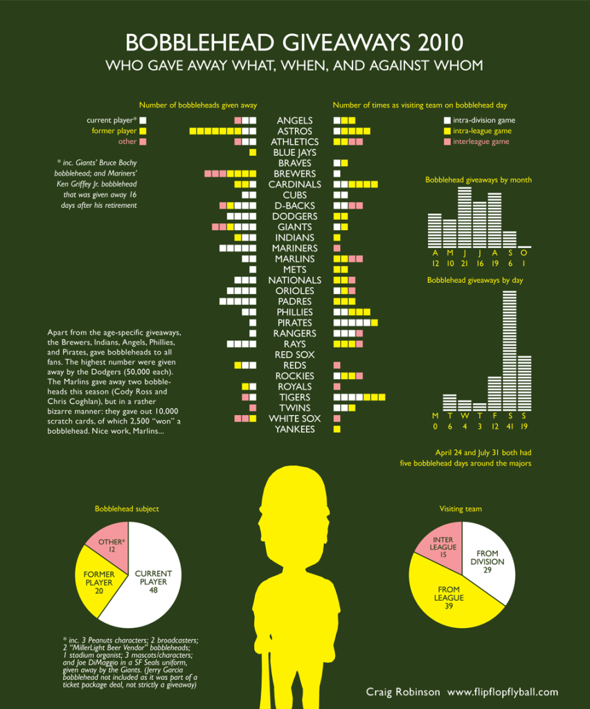
Well, there’s another reason to cry in Beantown. The fact that we were not part of any bobblehead giveaways this year. Flip Flop Fly Ball has created an infographic showing we are the only MLB team to not participate in a contest with a Bobblehead Giveaway. Perhaps next year we can turn things around…
A History of Search Engines
I recently was discussing some of the search engines of the past with colleagues. This infographic from WordStream shows a timeline of the search engines of the past and present. I myself am a Google girl, although I haven’t yet converted to Chrome. And we all know my thoughts on Bing, don’t get me started.
Hit the jump for the full image.
Read the rest of this entry »
Tag Cloud Creators
Recently I had a need to create some tag clouds. I came across a number of different tools. As I discovered each of them, I kept finding a better alternative. Below I’ve provided some information about 3 different tools which will allow you to create tag clouds. Happy creation!
Reality Dating
A nice visualization from Flowing Data of the differences between a first date vs. a reality show first date. Which gets me thinking, when is Tila coming back?
Famous Movie Quotes Visualized
Since beginning at Staples, I have realized that I need to start watching more movies. I did not know the famous line “That’s not a knife.” Good thing I wasn’t hired for my knowledge of movie lines. Any who, Nathan Yau over at Flowing Data has created some great visualizations of famous movie lines. Unfortunately, the aforementioned quote is not included.
Fast Food Facts
I read this a few days ago, and went to McDonald’s this past weekend. I couldn’t help but think about some of these numbers…
Click the image to view all the facts! They get more disgusting as it goes on!
via I Am Bored
Social Media Users
Who is using which sites? This infographic from Flowtown breaks it down nicely. One thing that surprises me is how few 18-24 year olds are using LinkedIn, but perhaps that’s just relative to the amount of other folks using it.


