A Day In the Life of MBTA Buses
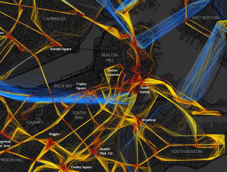
A beautiful depiction of the location/speed of MBTA buses from last Friday. Bostonography used the NextBus data to create this map of the bus routes. The colors indicate the speed the bus is traveling: blue = >25 MPH, yellow = 10-25 MPH and red = <10 MPH. The lack of blue frightens me! I will continue to be glad that I neither have to drive nor take a bus in downtown Boston very often.
(click image to see full map)
For the most part buses on this day had average speeds predictably somewhere below the normal city street speed limit, with the very slow spots being around major intersections and hubs like Ruggles or Harvard Square. There are also some generally slow areas besides those, such as most of downtown. As you can see, most of the MBTA system would be toast if faced with the classic Speed scenario. The “fast” (and remember this category goes all the way down to 25 mph) lines are mostly confined to the rush hour expressway routes and some suburban roads. I expected to see more red than there is, though. I don’t often ride the bus, but the experiences burned in my mind are things like watching pedestrians cross the Mass Ave bridge more quickly than my #1. – Andy Woodruff
It would be interesting to include more data and create an interactive model to show patterns over days/weeks for certain times or events. (I’m sure a Red Sox game would create a lot more red in the Fenway area!) This really makes me want to take some cartography classes!
via @mbtaGM
