Convert Film Cameras to Digital?
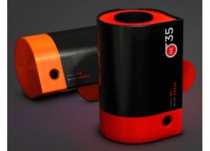
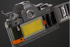
What if there were a way to insert something into a film camera into a digital camera?
I just came across this post today, and thought it was a spectacular idea. However, upon reading, I realize that this product was released on April Fools Day.
Although the product doesn’t actually exist, there was such a strong showing of support for the product that the company who ran the hoax – Rogge & Pott Design – is “looking into the possibilities”.
The idea is that a sheet extends where the film would normally be and when the camera takes an image the information is translated digitally to the memory in the canister.
via Core77
Muppets –> Angry Birds
Want to know what the Muppets and the cast of Angry Birds have in common? Gamefreaks has the answer:
via @BostonKate
Giant Office Supplies
Being a Staples employee, you’re required to have a healthy obsession with office supplies. So when I saw the installment of giant office supplies, I couldn’t help but smile a bit.
You may be wondering the purpose of these large office supplies. Well, the property developers were showing the space and wanted to communicate that it could be split into 4 different sections. These supplies provided the boundary lines between those areas.
via SwissMiss
How To Become a Giant
Ryuji Nakamura has created a house which sits on top of a MacBook and basically makes anyone sitting down to the computer a giant.
This would be hilarious to use during a Chat Roulette session!
via SwissMiss
Ranking of Angry Bird Birds
The Oatmeal has created a ranking of the birds present in the Angry Birds game. I totally agree with their ratings, I just wish they had included the huge red bird! Now, to get over to Newbury Comics to buy the plush!
via Mashable
The United States of Shame / The United States of Awesome
A little while back I posted a map of The United States of Autocomplete. I now present you with two new interpretations of a map of the US. These are the things states are the worst at (from pleated jeans) and what your state does really well (from Political Language). I’m a born and bred Masshole Massachusett and I am guilty/proud of embodying both what Mass is worst at (bad driving) and what Mass is good at (college graduates).
It’s funny to see how some of them match.
NY (clearly influenced by NYC): Worst Daily Commute = Awesome Transit Use.
Utah: Most Liberalized Prostitution Laws = Worst Crime
North Carolina: Worst Teacher Salaries = Best Value University
Michigan: Best Freshwater Access = Highest Unemployment
via FlowingData
Don’t Touch That!
You’ll get your fingerprints all over my …….!
Well, George Kokkinidis at Design Language News decided that he was going to do just that! He wiped clean his iPad and started using an app (being sure to get his fingerprints on the screen) and then photographed his fingerprints on the screen.
Can you tell what apps he’s using in these two examples?
Hit the jump to see the answer and the rest of the apps.
A New Way to Recycle Paper
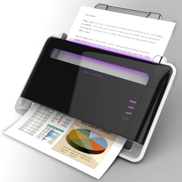
Sharsha Lee has created a concept which brings a new meaning to recycling paper. The Eco Printer basically takes paper that’s already been printed on, wipes it clean and prints on it again. An interesting concept. There’s concern in the comments about someone erasing an important document, but couldn’t someone just as easily shred an important document??
via Yanko Design
Analyzing the Digital Maps
Came across this great article on 41Latitude which compares Google Maps’ labels (left) with Bing (right) and MapQuest. It’s interesting to compare the maps side to side. I strictly use Google Maps, for not only a better mapping service, but also because it’s just easier!
The author’s first hypothesis is that Google Maps has a lesser density of labels when compared to the other maps. However, when looking at the area shown above, Google had 86 city labels, Bing had 91, and MapQuest had 83. So that is not the reason for GMap’s superiority.
One of the 3 reasons Justin O’Beirne gives for the Google Maps’ legibility is the fact that they have non-opaque white outlines around the labels. The images below show Google Maps (left) and MapQuest.
As you can see, Yahoo!’s decision to allow background map information to remain visible underneath its city labels harms their overall legibility. Individual letters are broken up by other dark lines, forcing users to give a second look to many labels.
The second reason he gives is the greater number of “classes” of labels for cities. (Think CSS headings). Google maps has 4 different sizes of labels while Bing and MapQuest only have 3. The third reason he gives is the fact that the smaller labels are shown in a lighter color, which makes them fade slightly into the background.
Additionally, a few “tricks” are pointed out – not necessarily related to the labels – that help with Google Maps’ readability. The first is label decluttering around major metropolitan areas, basically smaller suburbs aren’t shown. Also, Google displays city markers further apart than Bing (not that it is moving cities, just that it is showing cities that are father apart from each other).
In conclusion, Google Maps is better. Although I guess I should say Bing has addressed some of the issues pointed out in the critique.
via ChartPorn
It’s All Relative
A creative and simple representation of time. Marcus Kraft explains his work:
sometimes, one second can change your whole life. on the other hand, a whole year can feel very boring, unimportant and dull. what if one year is as long as one day or even one second? — maybe there’s no difference at all.
via SwissMiss


