Elements of Design
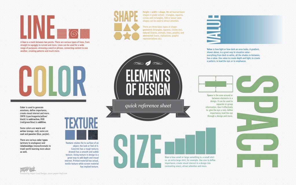
Paper Leaf has created a quick reference sheet for design elements. It’s made to be used as a poster or a desktop background. Click on the link above to see download options.
via Chart Porn
A Balloon Flip Book
What this video has to do with MTV I’m not sure, but it is pretty awesome!
via @therealmasoud via @janepyle
How Did You Find Out About Osama bin Laden’s Death?
Well, I was watching Celebrity Apprentice (I know, I know, it’s bad. But I like watching them complete the tasks and then fight it out afterwards. Get over it!) on delay by about 15 minutes when I saw the message pop-up that the President would soon be addressing the country. I wasn’t really sure what it was. Were we attacked? Did we attack someone? Was the economy cured? So, instead of stopping the DVR and jumping to live TV I grabbed my phone to check Twitter. Scrolling through the previous 60 minutes of Tweets I finally arrived at the tweets saying that Osama bin Laden had been killed.
I then stopped the DVR and turned to live TV to the news coverage discussing what they had been told, the events that transpired years ago leading up to this, as well as speculation about what had happened. I then continued to check Twitter and update my status while I waited the hour before President Obama came on and made the speech. I’m glad I waited. Even though I knew what he was going to be talking about, it made it all real and he was able to put things into perspective.
But enough about that, why I’m writing the post. I was reading a CNN article titled Bin Laden’s death sets Twitter record and when I got to the end, I read a lot of stories that were similar to mine.
“While watching a show on the Tivo, my son was checking twitter on his phone and told us to put on live TV.”
“Saw a post on FB, verified it on NYT, and then yelled for my fiance to turn on the news.”
“I saw comments on Facebook, and then read about it on my NPR News App on my phone, and then turned on the TV.”
There has been a lot of news coverage about how people are getting more and more of their news from the Internet and Twitter, but it’s interesting that when a breaking news story hit, people turned to the TVs. Part of this might be explained by the fact that it was a Sunday evening and most Americans were probably at home where many of them have a television. I know when I’m at work (or as on 9/11 at school) I didn’t have access to a television where I could find the news.
What are your thoughts? Where did you first hear/see that Osama had been killed? What did you do next?
Flyer Goodness
I came across this great blog while I was searching for some inspiration for a project for my graphic design class. Flyer Goodness explain that…
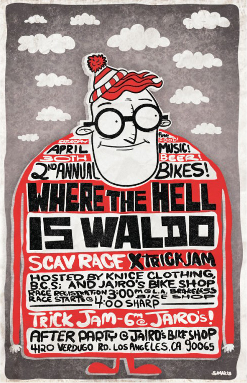
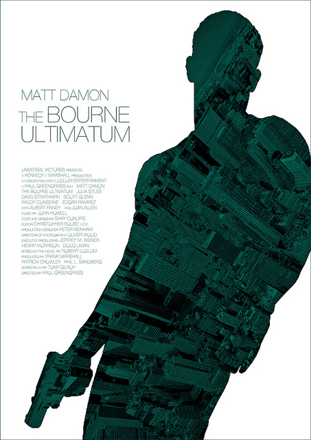
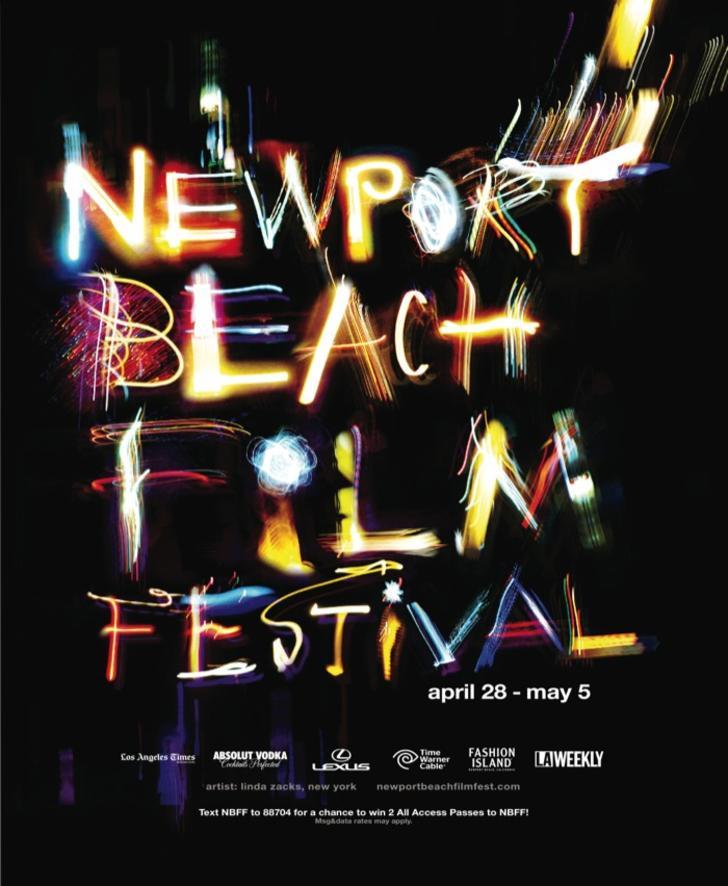
Flyer Goodness is a flyer design blog dedicated to highlighting disposable art — masterpieces that are thrown in the garbage, rained on, and plastered over in less than a week.
Some of my favorites are below. (The images link to the post that includes that poster.)
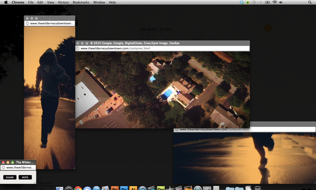
The Wilderness Downtown
My professor showed me this Chrome Experiment called The Wilderness Downtown. It is an experimental video by Chris Milk which taps into some of the interesting potential of HTML5 and Google Chrome.
In order to get started you’ve got to provide an address. It asks for your childhood home, but you can put in any address (HINT: Provide an address with good Google Maps/Street View coverage.) From there, you’re taken on a journey of sorts. Just turn on your speakers, sit back, and enjoy the ride.
Try it for yourself! I would assume it works best in Chrome, which if you aren’t using it, you should be.
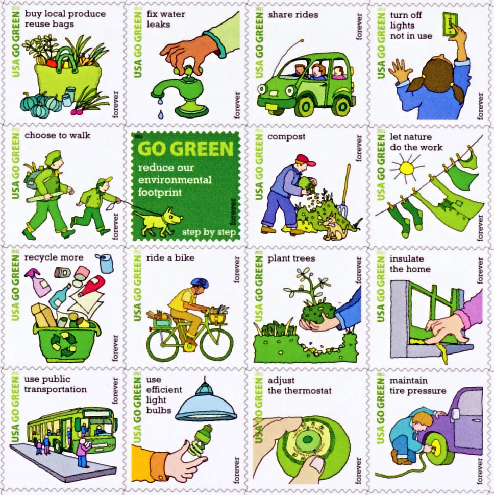
“Go Green” Forever Stamps from the USPS
My friend @certaintragedy just tweeted about the new Go Green Forever stamps being sold by the USPS.
Overall a very interesting campaign that I’m sure will raise some eyebrows when the letters arrive in people’s mailboxes. However, I’m wondering where the “send an email” stamp is. After all, it’s much greener (see comments) to send an electronic letter than to mail and deliver a paper letter.
Boston is a College Town
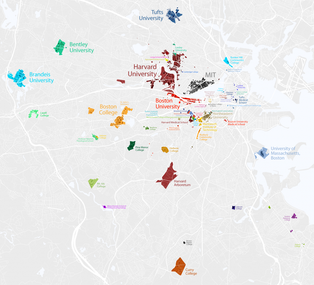
In case you didn’t know, Boston is a college town. Since I’m a visual person, I appreciated the map that Bill Rankin created of colleges inside the 128 belt. Upon further inspection, I realized that he had forgotten Bentley’s North Campus, but I think we can give him the benefit of the doubt for the other schools.
A very cool visualization indeed! (Click image to enlarge.)
via @chatzy84
nr1977
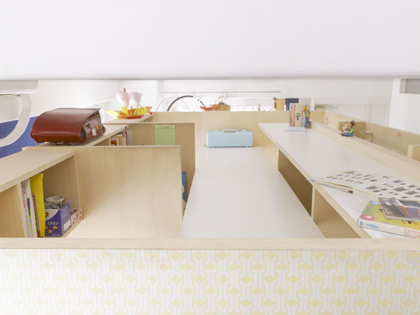
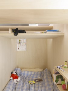
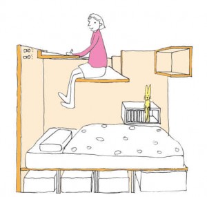
An interesting use of space by MihaDesign. This would be a great way to save space in a studio. Come to think of it, it’s the opposite of lofting your bed, which many students do in college.
I’ll have to remember this concept if I’m ever pressed for space, or just want to have an excuse to jump down on my bed!
via SwissMiss
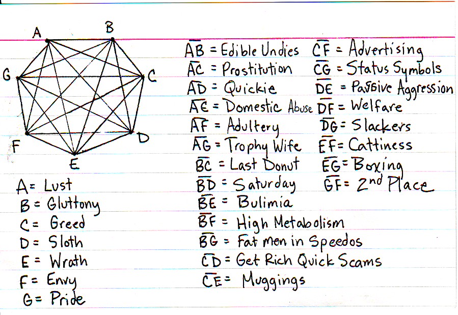
Interpreting the Seven Deadly Sins
Jessica Hagy presented an interesting look at the seven sins and what represents the areas that they overlap.
via Chart Port
Poor Button Placement
Radmin posted this rather unfortunate placement of a laptop’s power button.
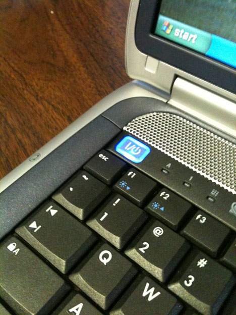
Although this could be a lot worse, it still isn’t a good idea to put the power button so close to another button. I hit ESC often – like to close out of full-screen – and I don’t want to close anything let alone shut the computer off.
Take a look at a good example of power button placement, the Apple Macbook Pro:
I do understand that sometimes there isn’t always enough room to play around with, the designers should take care to be sure the power button isn’t hit accidentally. I know they usually have a time limit that you need to push the button before it actually takes action. Just keep this in mind when you’re searching for a new computer. This isn’t something that you usually take into account.
via Core77
