Common Fonts Across Different OS
I am looking to embark on a slight redesign of my resumé, a tweaking shall we say. I want to design in a way so that it will come across consistently when viewed on different machines. One of the worst errors to make is using a font that doesn’t come through on other’s machines, followed only slightly behind by using Comic Sans. A quick Google search reveals the 18 “browser-safe fonts”. But don’t forget to read the notes at the bottom! The site also has screen shots from different OS and browsers. Now I just have to decide which one(s) to use!
Lack of Consistency in Photoshop CS4
Although I have yet to have time to immerse myself in CS4, I ran across a post by Neven Mrgan showing the different slider bars found in Photoshop CS4. Below are a sampling…
 It is a general guideline, that a similar design be used when the user is performing the same or similar action. Usability.gov’s guideline states “Allow users to perform tasks in the same sequence and manner across similar conditions” (Guideline 2:3).
In the case of the sliders, it is unnecessary to have multiple designs for the same control. The first three sliders are all performing the same purpose, to allow the user to select a value from a range of numbers. They each show the title, the value, and the slider.
The 4th slider is slightly different and shows the blending of two layers, and therefore needs an additional slider control. There is little to no reason for there to be different arrows.
The only slider pictured here that I can make a justification for variation is the last one. The blending of the two colors along the slider is helpful in determining the desired color mix.
I’m unsure why all the inconsistency in the design of this great program. It seems as though they’ve kept sliders from previous versions and improved upon them as new features were included, but never took the time to update the old ones. Hopefully by the time the next version comes along they’ll have taken the time to not only include some amazing new features (content-aware scaling comes to mind) but also improve the ease of use of the system by sticking to some well-established guidelines.
—-
via SwissMiss
Google Wave, demystified
What’s all the fuss about Google Wave? This video explains it. It seems like it is smashing GMail with Google Docs and MS Word’s “track changes”.
UPDATE: 11/22/2009
I have received my Google Wave invite (thanks to Kyle Bedell). But I’m not really sure what to do with it. I don’t really send e-mails to groups at this point in my life. I basically use gmail for personal communication and to get updates on geocaching and other listservs. It is blocked at work, so I couldn’t use it for that purpose even if I wanted to. I’ll have to recruit a friend to try it out with me.
—-
via SwissMiss
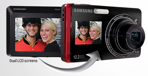
Samsung Dual View TL220
Find a problem, and create a design to fix it. That’s exactly what the people at Samsung have done. Presenting the Dual View TL222:
I mean, I’m sure we’ve all taken a photo of ourselves and others and tried to guess or not if we’re in the frame. The only bad thing about this is that the advertisement doesn’t depict this self-photo taking…
New Boston T Map
Last week the MBTA released a new T map. Although it may not be as famous as the London Underground map, to me it’s significantly more useful. I appreciate the addition of the bus routes and it helps me get a perspective of the relationships between all the different stations. It still doesn’t help me see a clear way to the airport though…
via WBZ.com
Notepods
 I love these notepods. Although I’m sure they’re great for designing iPhone apps and/or mobile websites I would probably just use them to write things on. Perhaps sketch out some of the icons that I wish my pretend iPhone had.
via SwissMiss
Can you paint with all the Colors of the Wind?
Color plays a vital role in a lot of things that we do.
The SAP Design Guild has an article about all things color. It is basically an overview of all that can go good and bad with color including chromostereoopis, lateral inhibition, and subjective contours.
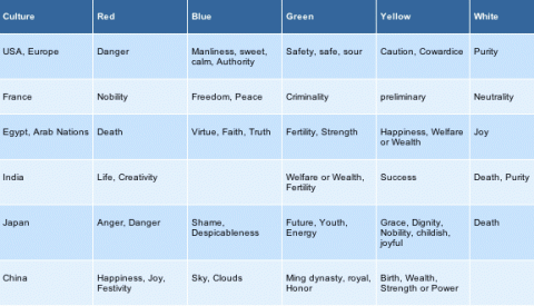
As I’m sure we all learned in English class at one point that a word can have a connotative and denotative meaning. The way that I learned it was that red was the color of an apple (denotative) and also meant danger (connotative). This chart (from SAP Design Guild) shows the connotative meaning for colors across different cultures.

But what about those people who cannot see color [about 8% of the male population and some smaller % of the female population]? WeAreColorblind.com provides patterns for designing with colorblindness in mind. They also provide tools and examples of good design and poor design.
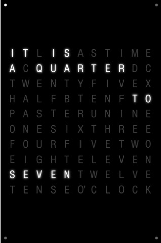
clocktwo for the iPhone
I really enjoy clocks! I plan on eventually designing some rooms around clocks. For now I have to display my creativity through cheaper means; one is through my screen saver – DropClock – which is a series of numbers which fall for a minute into water.
 If I had an iPhone, I’d strongly consider using clocktwo, which is very similar in its design to DropClock. Black, white, simple. This one however is a little bit harder to actually tell what time, which is probably the most important thing about a clock. Still, it’s pretty cool to look at.
Actual iPhone users [wishing I were in this group] look to be complaining that it cannot be set as a wallpaper. It would be cool to be able to just touch to see the time, as opposed to -I assume – having to open the app.
via SwissMiss
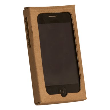
iPhone “Recession” Case
 A great iPhone case available from Case-Mate. It’s not waterproof, it could be flammable, but its cheap and won’t scratch your iPhone while protecting it. Unfortunately, they’re out of stock. But for only $0.99 it could be yours!
via SwissMiss
iPhone Keyboard
 For those of you who do not like the iPhone because it doesn’t have a “real” keyboard, I present to you the iTwinge from Mobile Mechatronics. For just $29.99 (+5.00 shipping & handling) this can be yours! (It isn’t available until November, but you can pre-order today!)
I, however, will continue to be jealous of people with iPhones and await the day that I will get my hands on one, with no iTwinge between us.
via Appletell


