Archive for the ‘Usability’ Category
iPhone Keyboard
 For those of you who do not like the iPhone because it doesn’t have a “real” keyboard, I present to you the iTwinge from Mobile Mechatronics. For just $29.99 (+5.00 shipping & handling) this can be yours! (It isn’t available until November, but you can pre-order today!)
I, however, will continue to be jealous of people with iPhones and await the day that I will get my hands on one, with no iTwinge between us.
via Appletell
Credit Card Both Ways?
Wait! Does this mean I can put my credit card in either way????? It would still be easier to just wave my phone over some pad.
Password Masking – Uncessary?
Jakob Nielson says so!
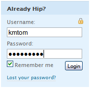
“Usability suffers when users type in passwords and the only feedback they get is a row of bullets. Typically, masking passwords doesn’t even increase security, but it does cost you business due to login failures.”
 There are times when there are people looking over your shoulder when you enter your password. Perhaps you’re borrowing a friend’s computer to check your e-mail. Or even a stranger’s computer [yes, I have been asked by a stranger to use my computer to check their e-mail. I obliged.].
I do however see Jakob’s point that it is really annoying! The iPhone does a nice job of allowing you to see the letter until you type the next one it. It’s invaluable, and I assume if I actually used an iPhone keyboard on a regular basis it wouldn’t matter quite so much, but then again I couldn’t imagine not having it.
I’m torn, but I probably wouldn’t go as far to say that they are uncessary, especially with as secure information as banking or investment.
Appropriate Contrast?
CheckMyColours.com is a site which evaluates the contrast of the colors on a particular site. It’s another tool to be added when designing a site. Don’t go just on the number of failures. Look at where you’re failing; that font may not end up on your site, depending on how you code.
—–
via SwissMiss
