A Day In the Life of MBTA Buses
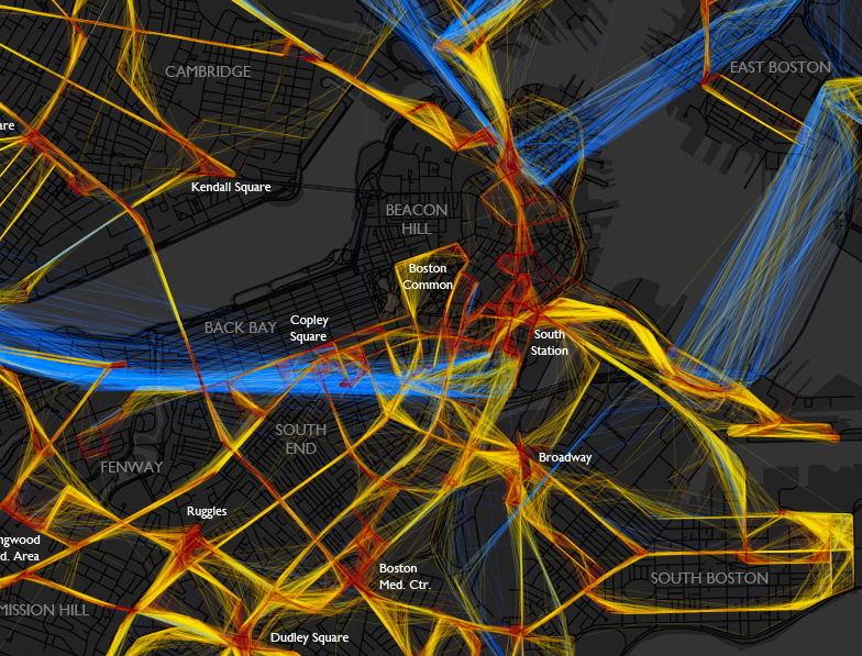
A beautiful depiction of the location/speed of MBTA buses from last Friday. Bostonography used the NextBus data to create this map of the bus routes. The colors indicate the speed the bus is traveling: blue = >25 MPH, yellow = 10-25 MPH and red = <10 MPH. The lack of blue frightens me! I will continue to be glad that I neither have to drive nor take a bus in downtown Boston very often.
(click image to see full map)
For the most part buses on this day had average speeds predictably somewhere below the normal city street speed limit, with the very slow spots being around major intersections and hubs like Ruggles or Harvard Square. There are also some generally slow areas besides those, such as most of downtown. As you can see, most of the MBTA system would be toast if faced with the classic Speed scenario. The “fast” (and remember this category goes all the way down to 25 mph) lines are mostly confined to the rush hour expressway routes and some suburban roads. I expected to see more red than there is, though. I don’t often ride the bus, but the experiences burned in my mind are things like watching pedestrians cross the Mass Ave bridge more quickly than my #1. – Andy Woodruff
It would be interesting to include more data and create an interactive model to show patterns over days/weeks for certain times or events. (I’m sure a Red Sox game would create a lot more red in the Fenway area!) This really makes me want to take some cartography classes!
via @mbtaGM
Visualizing Population Growth
Last week the world’s population reached 7 billion people. NPR had an interesting approach to illustrate how our population has grown so large using water dripping into and coming out of a hole on the bottom of a glass.
via Sarah Brown
Cool Sticky Notes
With my healthy obsession with office supplies, I always love seeing new twists to a classic item. These two twists on a Post-It are interesting. I would love to use the Block Notes to create a to-do list and I could see myself wearing the Post-It note watch grocery shopping.
via Toxel and Designer Daily
Papercuts
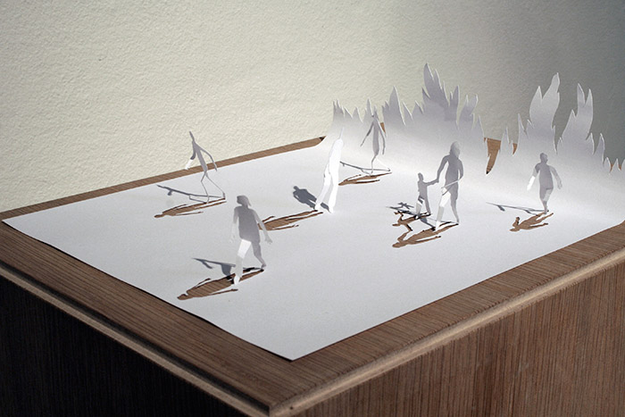
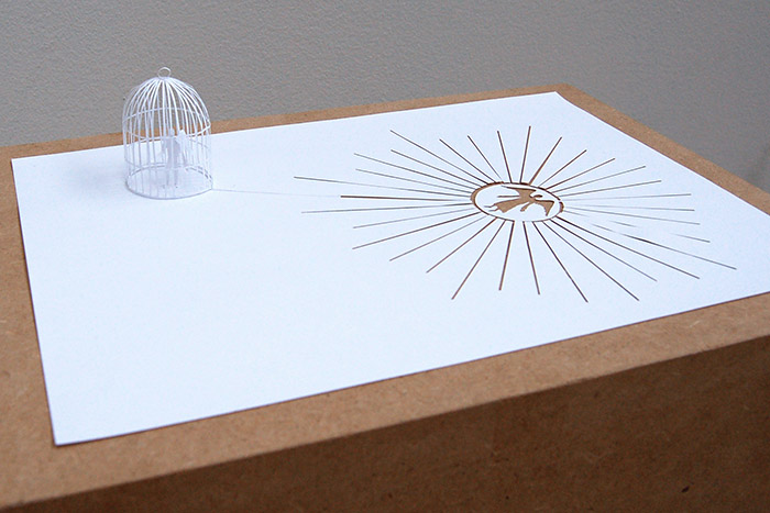
Peter Callesen shows of some impressive cutting and folding skills in his “A4 Papercuts” collection.
via Designer Daily
Touchscreen Gloves
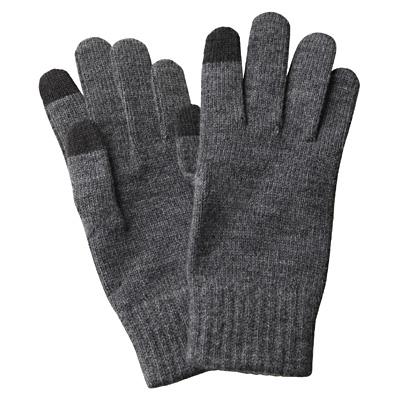
I bought a pair of fingerless gloves for when I am out caching and using my phone. Unfortunately my hands still get really cold. I haven’t really been looking for anything, but I came across these cool gloves from Muji which use a conductive material woven in the index and thumb fingers.
For those of you who are handy with a needle, there’s always the DIY option. All you need is some conductive thread, a needle, and scissors.
via SwissMiss
Block Type
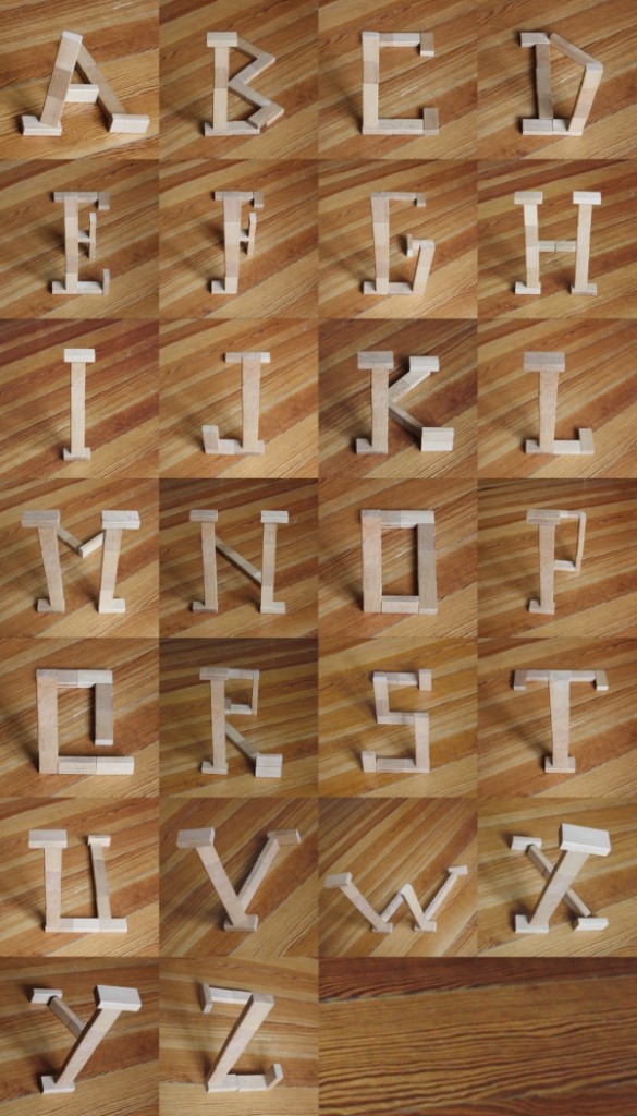
A really cool set of letters from Marc Böttler.
He uses perspective and depth to turn these rectangular wooden blocks into letters. Check out the K a little closer to see what I mean. (The left half of the letter goes from the ground up while the right side sits entirely on the ground).
via SwissMiss
Boston Map
This poster by Ork Posters of the Boston neighborhoods is pretty cool! I always get confused as to what is actually a part of Boston and what isn’t. This is helpful and interesting to look at all at the same time!
via beaktweets
My Type of Chess Set
I never really played Chess. I have a hard time strategizing, so it’s not really the game for me. I also had a hard time remember which pieces were which and what they could do. That’s why I really like checkers! Every piece moves diagonally forward 1 square (or jump), but if you have another piece on top of the other, it can move backwards.
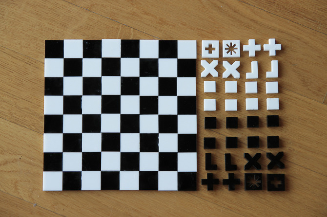
That’s why I had a glimmer of hope for my chess playing when I saw Alessia Mazzarella’s chess set. She uses the shape of the pieces to illustrate the moves that it can make.
Now if only this chess set could help me to solve this Geocaching Puzzle: Check & Mate.
via Core77
Netflix and Qwikster: What Am I Missing?
I was a $9.99 streaming and 1-DVD member of Netflix for about a year. I enjoyed the DVDs, but it usually takes me a few weeks to watch them, so they sit there unwatched for a while, but I figured for $2 more, why not. In July, Netflix announced that they would be changing their pricing structure so that my plan would now cost me $15.98. Well, bah humbug!
Just a few weeks ago (on Sept 1) the new pricing went into effect. I wasn’t sure if I was going to drop the DVD, I figured I would try it out and see if I can increase my DVD consumption (while simultaneously vowing to watch less TV in general).
Last week, Netflix announced that it was cutting the customer forecast as they were losing a ton of customers over the price hike (DUH!).
Well, this morning I awoke to find that Netflix has apologized and decided to make up for their mistakes by splitting the DVD service and streaming service onto two different websites. UH, WHAT? Is it just me? This doesn’t make sense to me. I like to be able to search all movies and see if one is streaming or DVD and to move things between queues if it becomes streaming. Why split them into two websites? What is the business plan behind it?
According to the Netflix CEO: “So we realized that streaming and DVD by mail are becoming two quite different businesses, with very different cost structures, different benefits that need to be marketed differently, and we need to let each grow and operate independently.”
Now that’s all fine and dandy, you probably should have two different teams working on things to make each one the best it can be, but does that mean you have to push that split onto consumers? Just because your internal team is structured that way doesn’t mean that’s how the customers want to interact with your product.
After checking out the comments on the announcement, I can see that I am not the only one who feels this way! You’re splitting up a single experience (I want to watch a movie, preferably by streaming, but if it’s not available yet, send me the DVD).
This has pushed me over the edge, and I will be canceling my DVD subscription (just as soon as I watch Schindler’s List).
UPDATE 9:45AM: I just came across this blog post by Joshua Porter about how Netflix in Danger of Ruining their User Experience (via @ryaninteractive).
