Archive for the ‘Design’ Category
Flyer Goodness
I came across this great blog while I was searching for some inspiration for a project for my graphic design class. Flyer Goodness explain that…
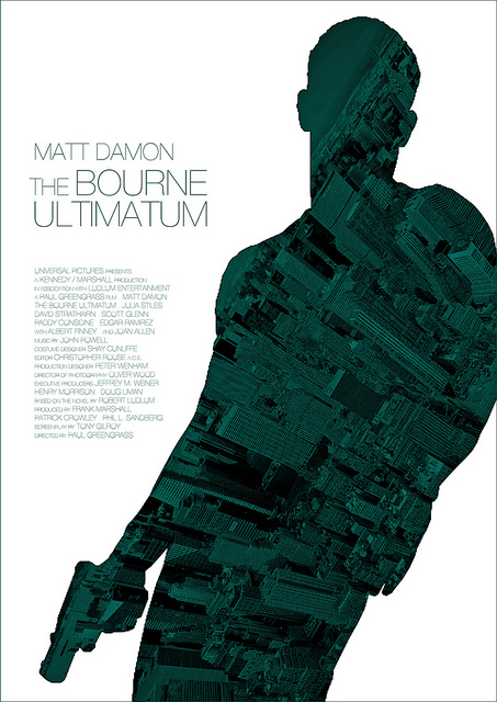
Flyer Goodness is a flyer design blog dedicated to highlighting disposable art — masterpieces that are thrown in the garbage, rained on, and plastered over in less than a week.
Some of my favorites are below. (The images link to the post that includes that poster.)
The Wilderness Downtown
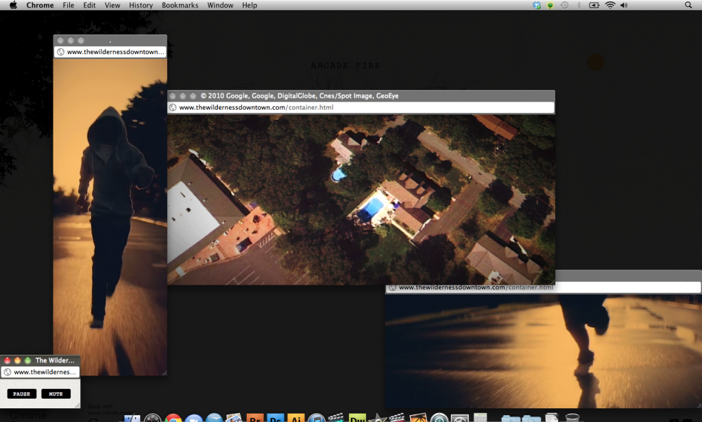
My professor showed me this Chrome Experiment called The Wilderness Downtown. It is an experimental video by Chris Milk which taps into some of the interesting potential of HTML5 and Google Chrome.
In order to get started you’ve got to provide an address. It asks for your childhood home, but you can put in any address (HINT: Provide an address with good Google Maps/Street View coverage.) From there, you’re taken on a journey of sorts. Just turn on your speakers, sit back, and enjoy the ride.
Try it for yourself! I would assume it works best in Chrome, which if you aren’t using it, you should be.
nr1977
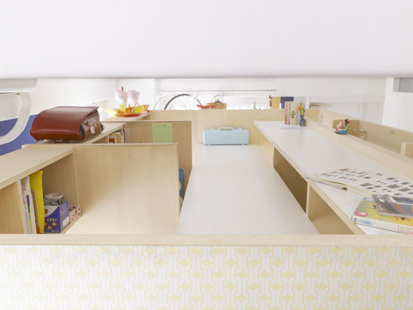
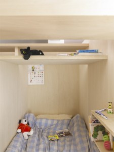
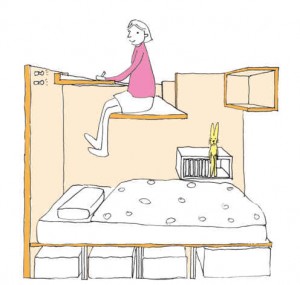
An interesting use of space by MihaDesign. This would be a great way to save space in a studio. Come to think of it, it’s the opposite of lofting your bed, which many students do in college.
I’ll have to remember this concept if I’m ever pressed for space, or just want to have an excuse to jump down on my bed!
via SwissMiss
Poor Button Placement
Radmin posted this rather unfortunate placement of a laptop’s power button.
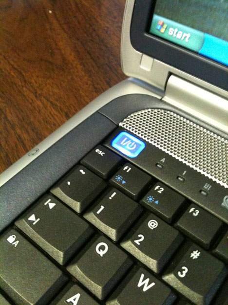
Although this could be a lot worse, it still isn’t a good idea to put the power button so close to another button. I hit ESC often – like to close out of full-screen – and I don’t want to close anything let alone shut the computer off.
Take a look at a good example of power button placement, the Apple Macbook Pro:
I do understand that sometimes there isn’t always enough room to play around with, the designers should take care to be sure the power button isn’t hit accidentally. I know they usually have a time limit that you need to push the button before it actually takes action. Just keep this in mind when you’re searching for a new computer. This isn’t something that you usually take into account.
via Core77
Convert Film Cameras to Digital?
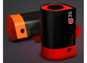
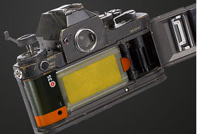
What if there were a way to insert something into a film camera into a digital camera?
I just came across this post today, and thought it was a spectacular idea. However, upon reading, I realize that this product was released on April Fools Day.
Although the product doesn’t actually exist, there was such a strong showing of support for the product that the company who ran the hoax – Rogge & Pott Design – is “looking into the possibilities”.
The idea is that a sheet extends where the film would normally be and when the camera takes an image the information is translated digitally to the memory in the canister.
via Core77
Giant Office Supplies
Being a Staples employee, you’re required to have a healthy obsession with office supplies. So when I saw the installment of giant office supplies, I couldn’t help but smile a bit.
You may be wondering the purpose of these large office supplies. Well, the property developers were showing the space and wanted to communicate that it could be split into 4 different sections. These supplies provided the boundary lines between those areas.
via SwissMiss
How To Become a Giant
Ryuji Nakamura has created a house which sits on top of a MacBook and basically makes anyone sitting down to the computer a giant.
This would be hilarious to use during a Chat Roulette session!
via SwissMiss
A New Way to Recycle Paper
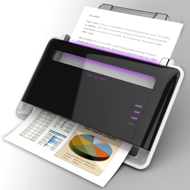
Sharsha Lee has created a concept which brings a new meaning to recycling paper. The Eco Printer basically takes paper that’s already been printed on, wipes it clean and prints on it again. An interesting concept. There’s concern in the comments about someone erasing an important document, but couldn’t someone just as easily shred an important document??
via Yanko Design
It’s All Relative
A creative and simple representation of time. Marcus Kraft explains his work:
sometimes, one second can change your whole life. on the other hand, a whole year can feel very boring, unimportant and dull. what if one year is as long as one day or even one second? — maybe there’s no difference at all.
via SwissMiss
The New Facebook Profile
I am pretty defiant when it comes to changes to Facebook. I had a hard time accepting the changes to something that I use multiple times a day, multiple times an hour when I don’t see the justification for the change. Regardless, they recently made a significant change to the Profile Pages. There has been a recent “movement” towards using the new Facebook profile layout to one’s advantage. Check them out: on reface.me
via Mashable
