Archive for the ‘Graphic Design’ Category
New Sub-Category: Graphic Design
In honor of my new coursework that I’ll be starting in less than a month, I’ve created a sub-category of “Graphic Design” under Design. I hope to have a lot of cool resources and examples as I move through my pursuit of a Certificate in Graphic Design!
Poster Design
Tutorial Lounge has provided a tutorial of “tips and tricks” to poster design.
Posters are designed to communicate a message and to cause great impact on the onlooker, however, this too is a fact that neither a passersby nor a driver will stop to read them and consume the message being conveyed. So in order to make the posters more communicating, they should be precise regarding the message, colors and the elements being used to convey it.
Their first tip is to consider the message, as it’s the most important part of the poster (really the only reason for it’s creation).
The next tip is to be creative and unique to make sure the viewer remembers your poster, and specifically the message.
Thirdly, there must be an appropriate aesthetic for the message conveyed. “For instance, if the product or revolves around a serious and decent message, you cannot put funky images or highly colorful layout for the poster.” They continue to talk of color choices, information hierarchy, composition and the emotional element.
They also suggest that you take into account where your poster will be placed in order to fit with that area’s aesthetic and be noticed.
Here are some of the examples of the poster designs shown in the article:
via @DesignModo
The Difference Between Twitter & Facebook
When asked about the difference between Twitter and Facebook, I usually reply “Facebook is for the people you knew in high school, and Twitter is for the people you wish you knew in high school.” Well, @shaylamaddox had a slightly different way of putting that, which was then turned into an illustration by Kiersten (although I can’t find the link to the original, she has some cool stuff on her blog).

via tweetmeme
Handy Hoodie Ideas
I have been known to wear a hoodie for many days of my life! I may or may not even be wearing one as I write this. But the folks over at Conceptual Devices have come up with other things to do with hoodies besides wearing them. Check it out. Even more ideas after the jump.
via @SwissMiss & Core77

clocktwo for the iPhone
I really enjoy clocks! I plan on eventually designing some rooms around clocks. For now I have to display my creativity through cheaper means; one is through my screen saver – DropClock – which is a series of numbers which fall for a minute into water.
 If I had an iPhone, I’d strongly consider using clocktwo, which is very similar in its design to DropClock. Black, white, simple. This one however is a little bit harder to actually tell what time, which is probably the most important thing about a clock. Still, it’s pretty cool to look at.
Actual iPhone users [wishing I were in this group] look to be complaining that it cannot be set as a wallpaper. It would be cool to be able to just touch to see the time, as opposed to -I assume – having to open the app.
via SwissMiss
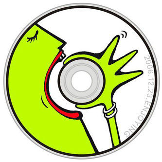
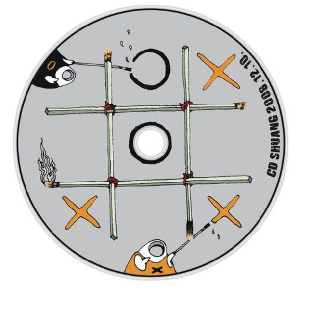
The Hole in a CD

Appropriate Contrast?
CheckMyColours.com is a site which evaluates the contrast of the colors on a particular site. It’s another tool to be added when designing a site. Don’t go just on the number of failures. Look at where you’re failing; that font may not end up on your site, depending on how you code.
—–
via SwissMiss